A poster for an
art show.
Client: Wesley Hammer
This is a poster I designed for Wesley Hammer's Senior Art Show. They provided the background images and commissioned me to turn one of them into a poster. This poster's main job was to advertise Hammer's event, so I prioritized type and color for this work to improve legibility and to draw the viewer's eye across the page and interest them in reading the whole poster. I also edited the photos that Hammer supplied by enhancing the contrast and color of the images to complement the text.
Process
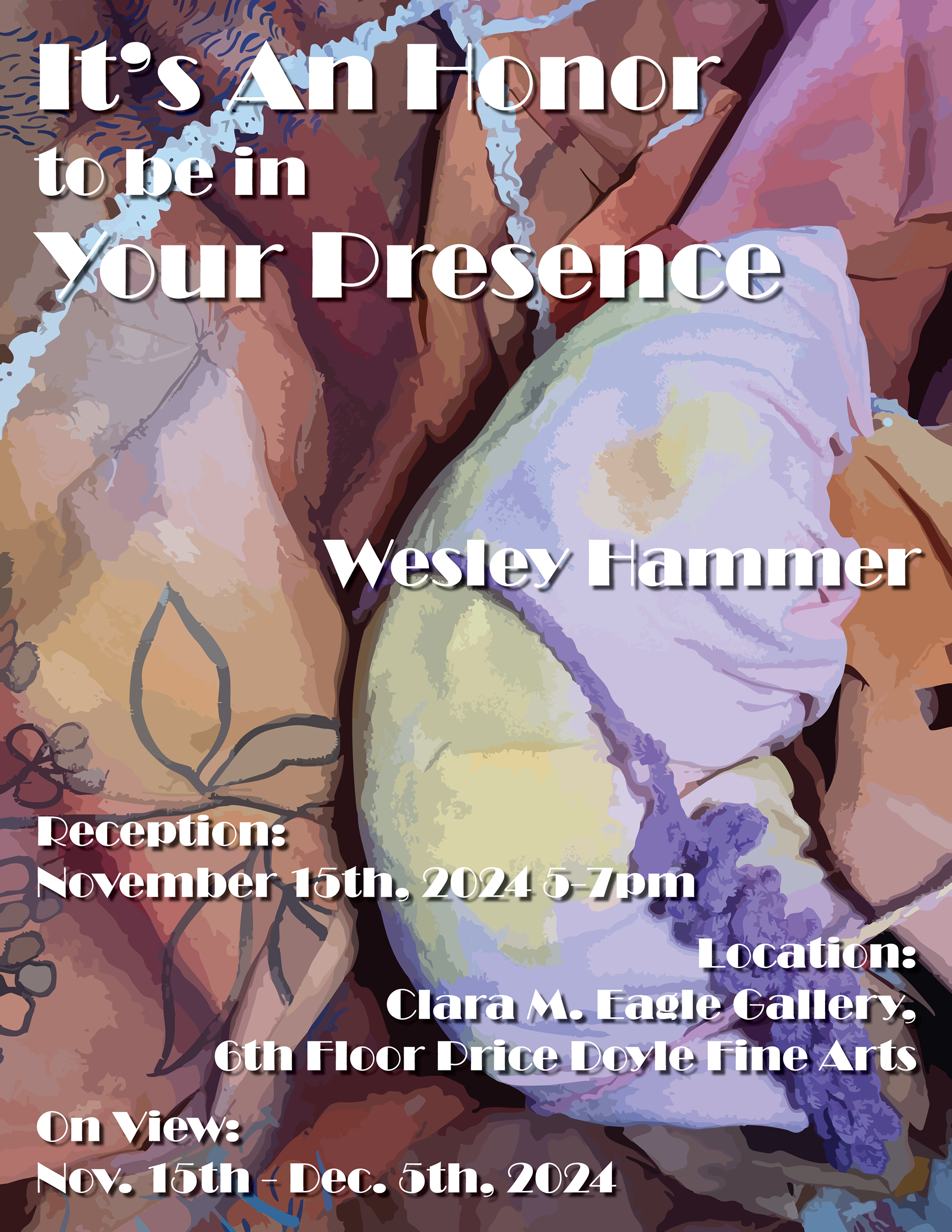
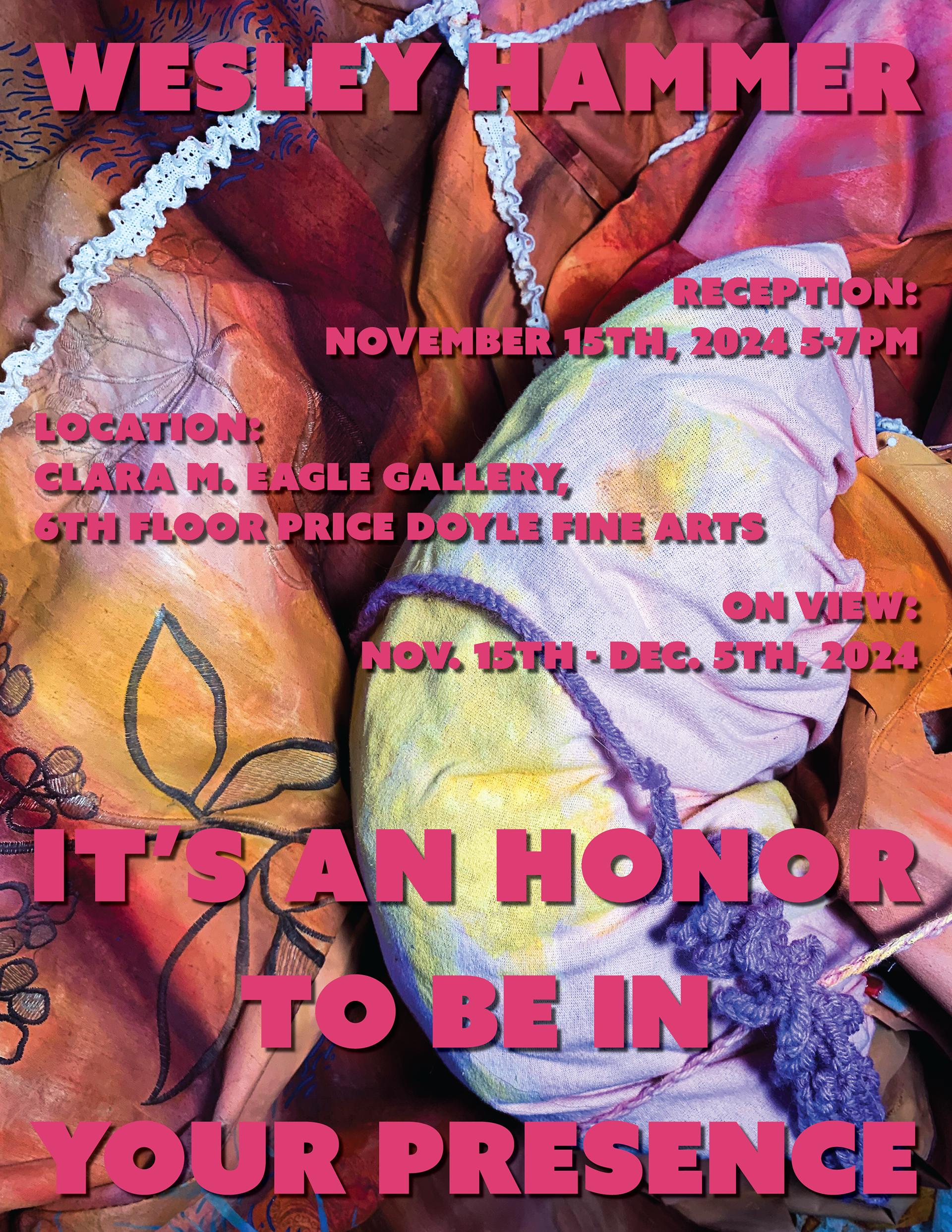
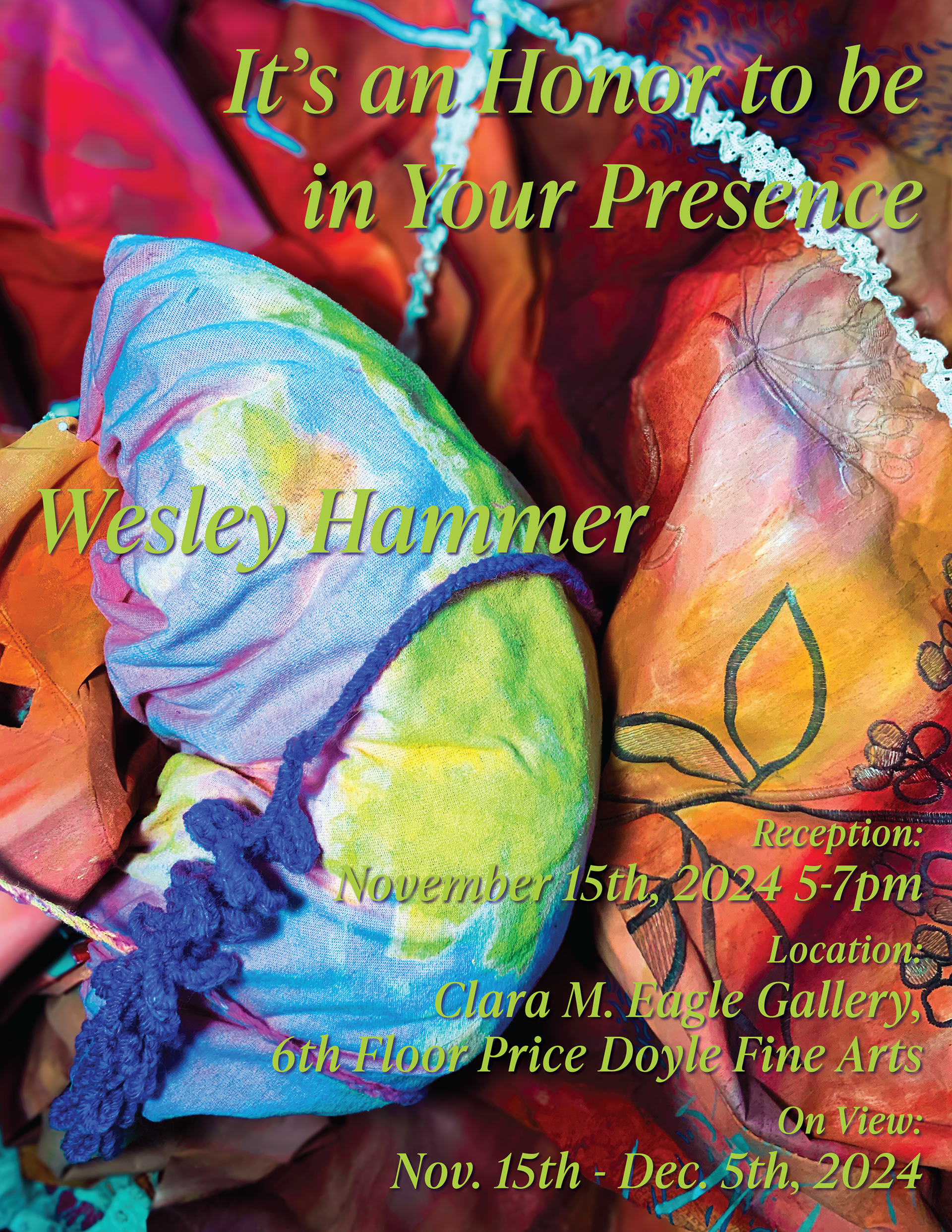
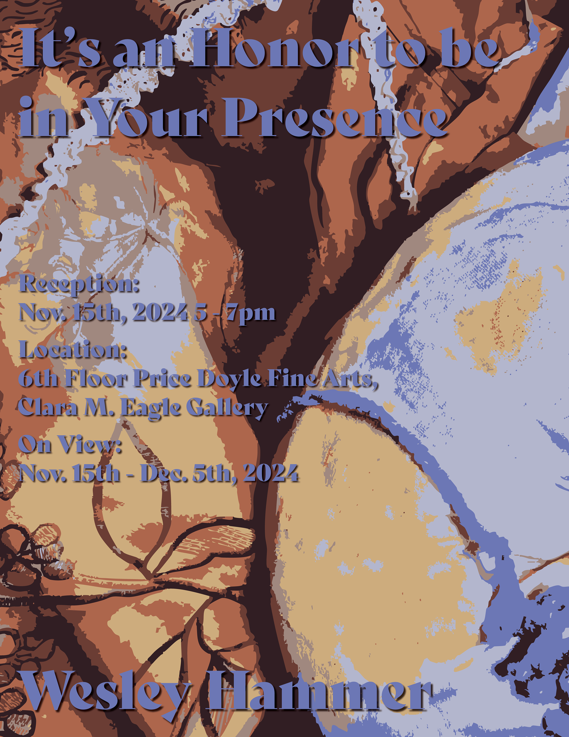
These were my first drafts for this project. The client didn't know exactly what they wanted, so I did a wide range of designs with their preferred photo they sent me. I organized the text in a multitude of ways and used all different fonts and font colors to see what they liked. I also edited the photo in different ways -- zooming in, flipping the image, using more saturation, using image trace to give the poster a more blocky look -- I did my best to give a good variety so that I could narrow down the design later.
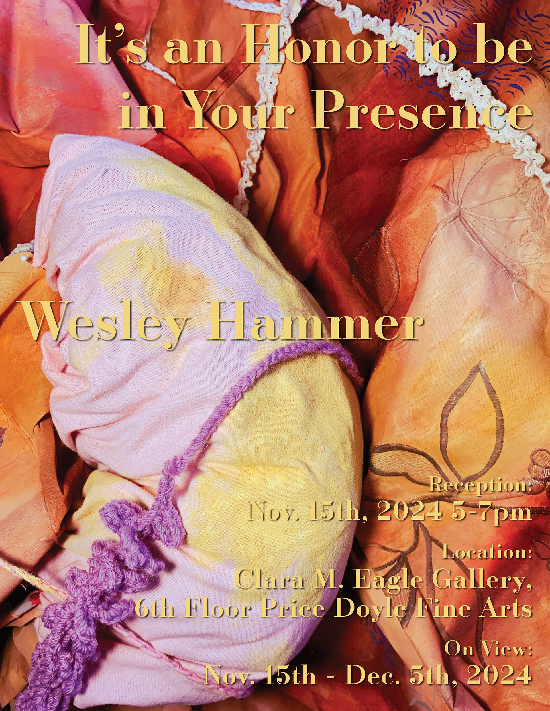
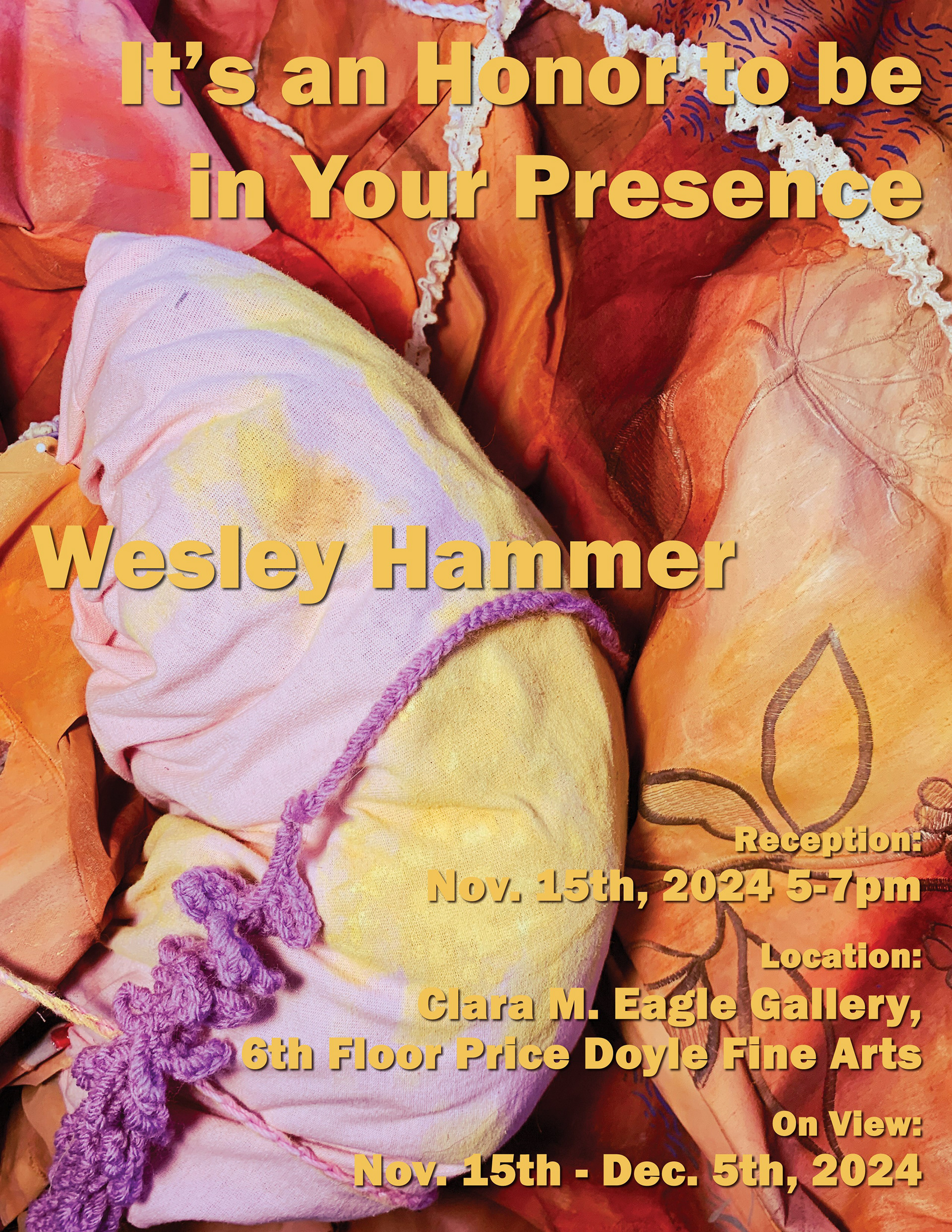
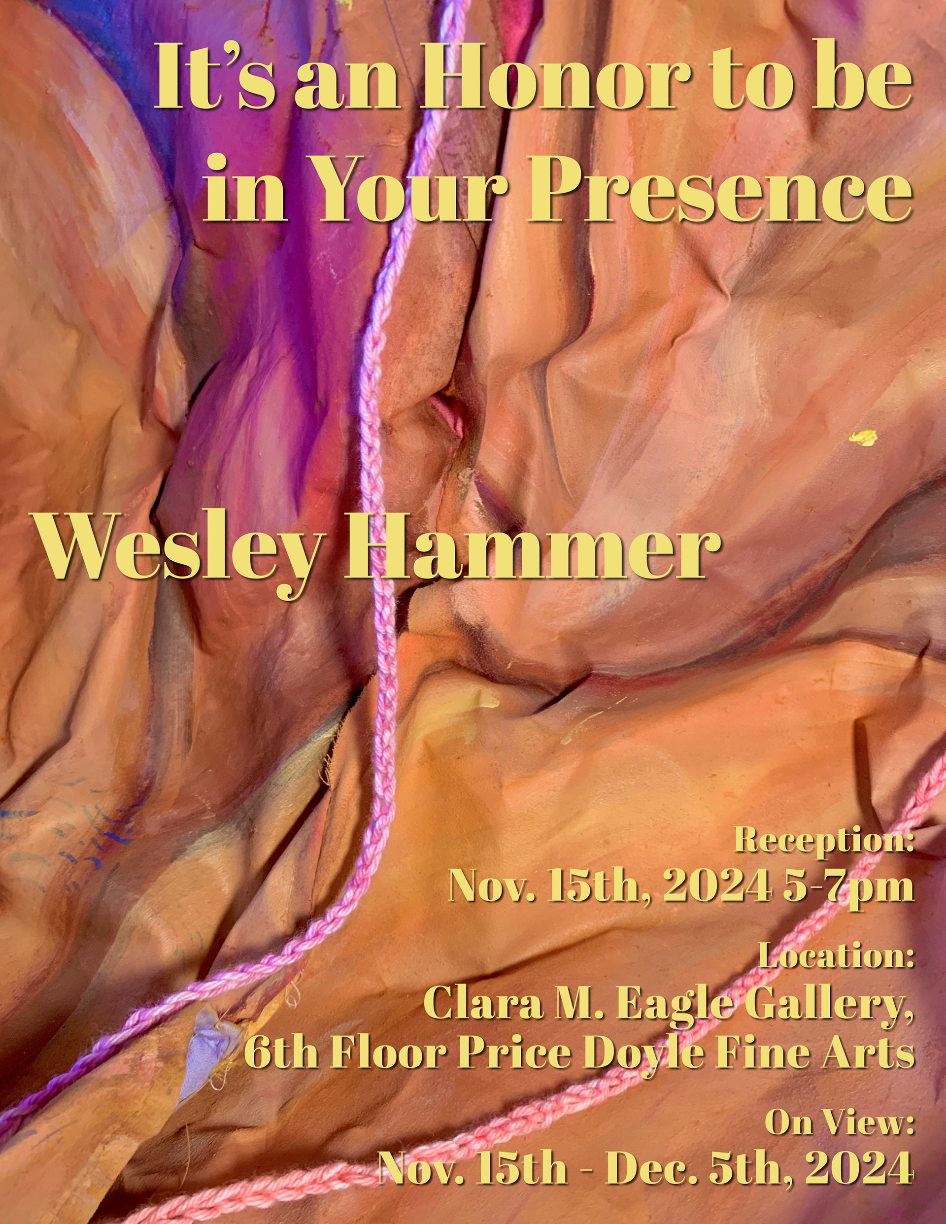
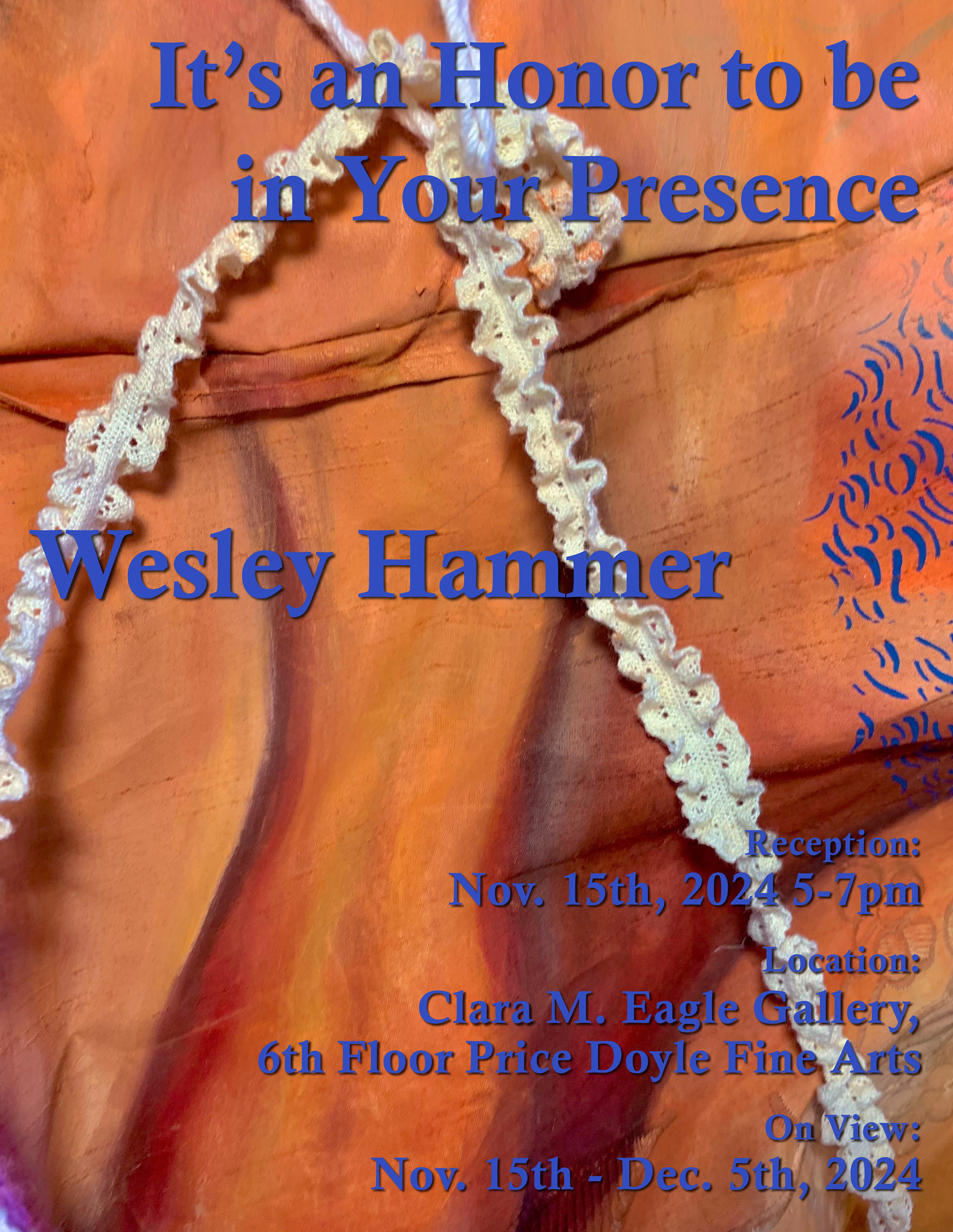
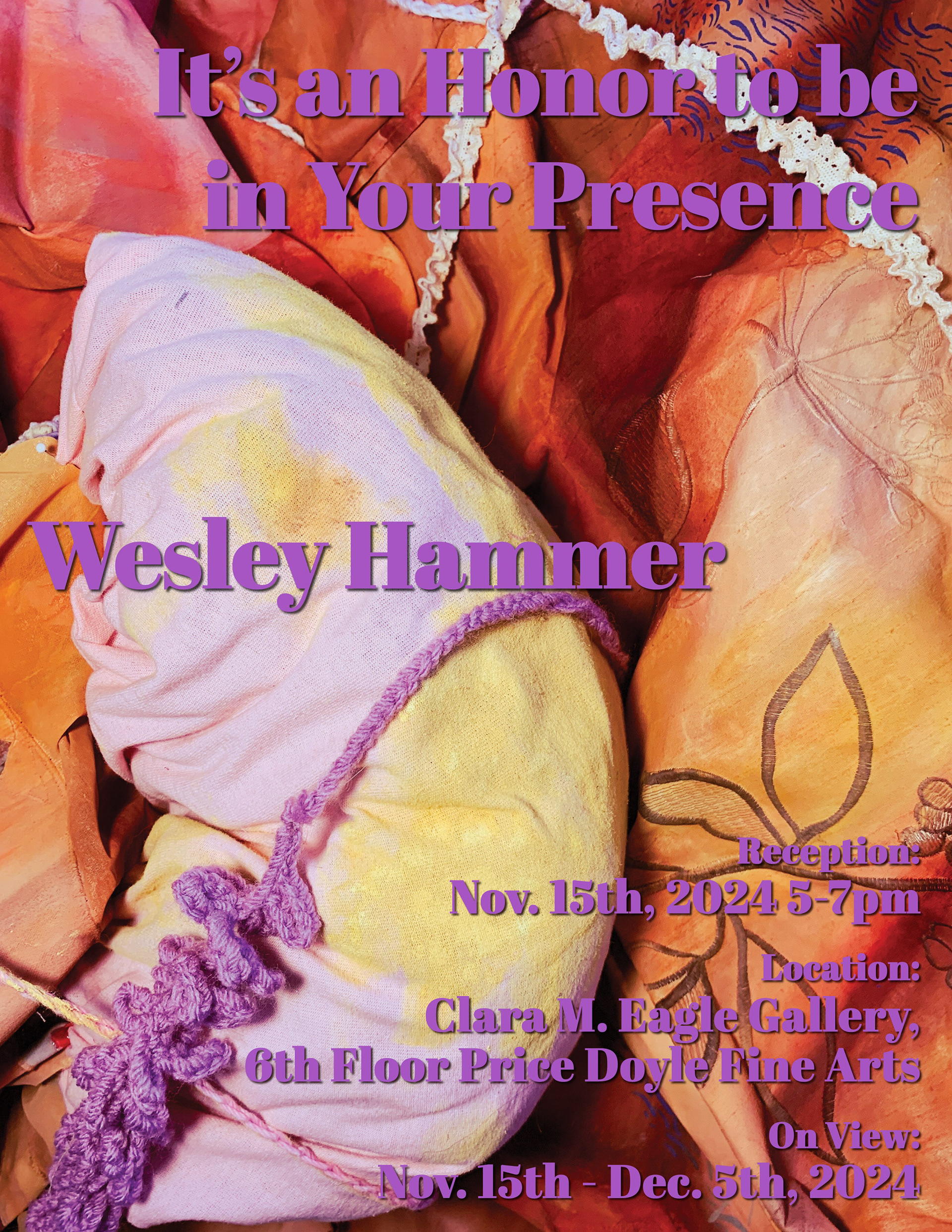
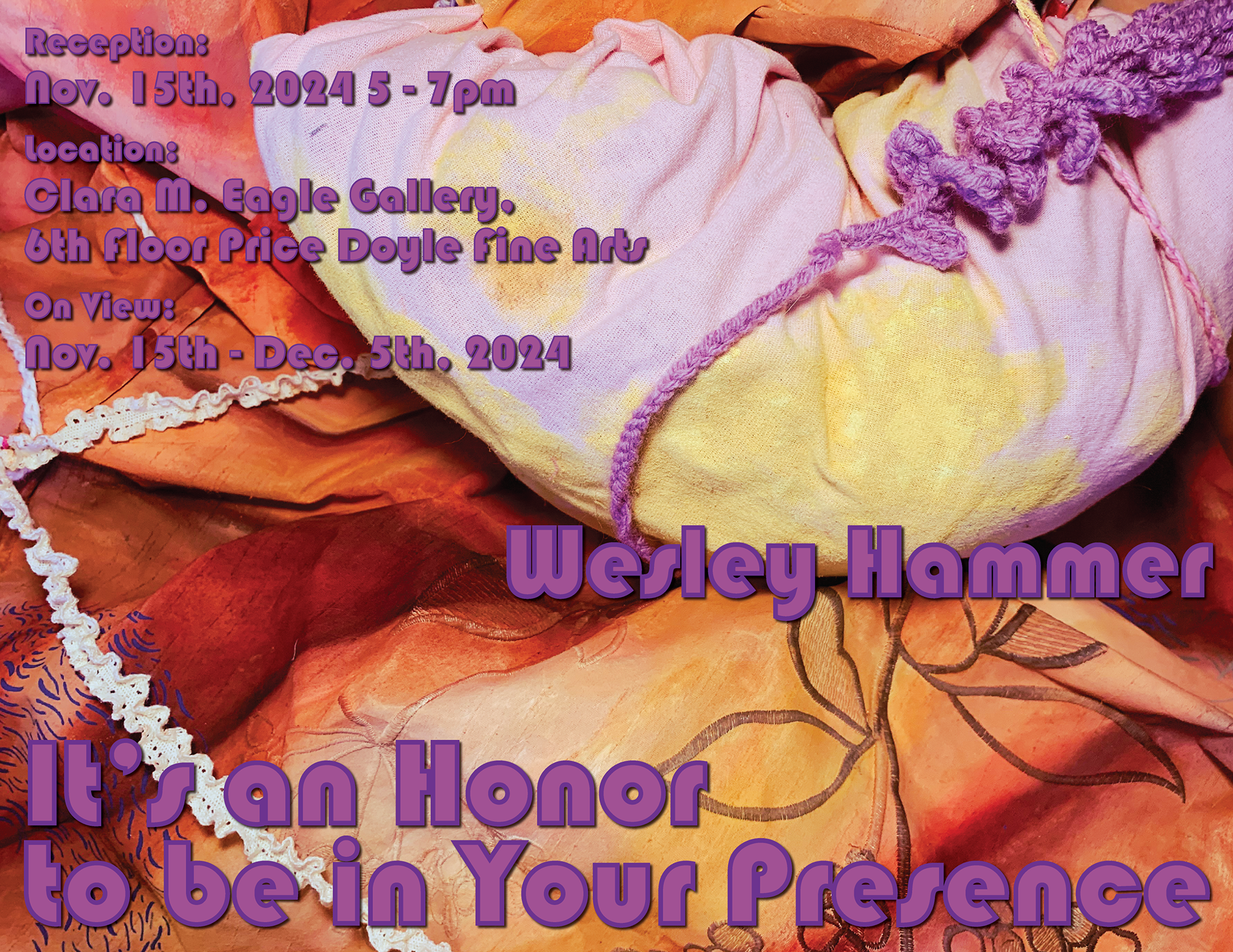
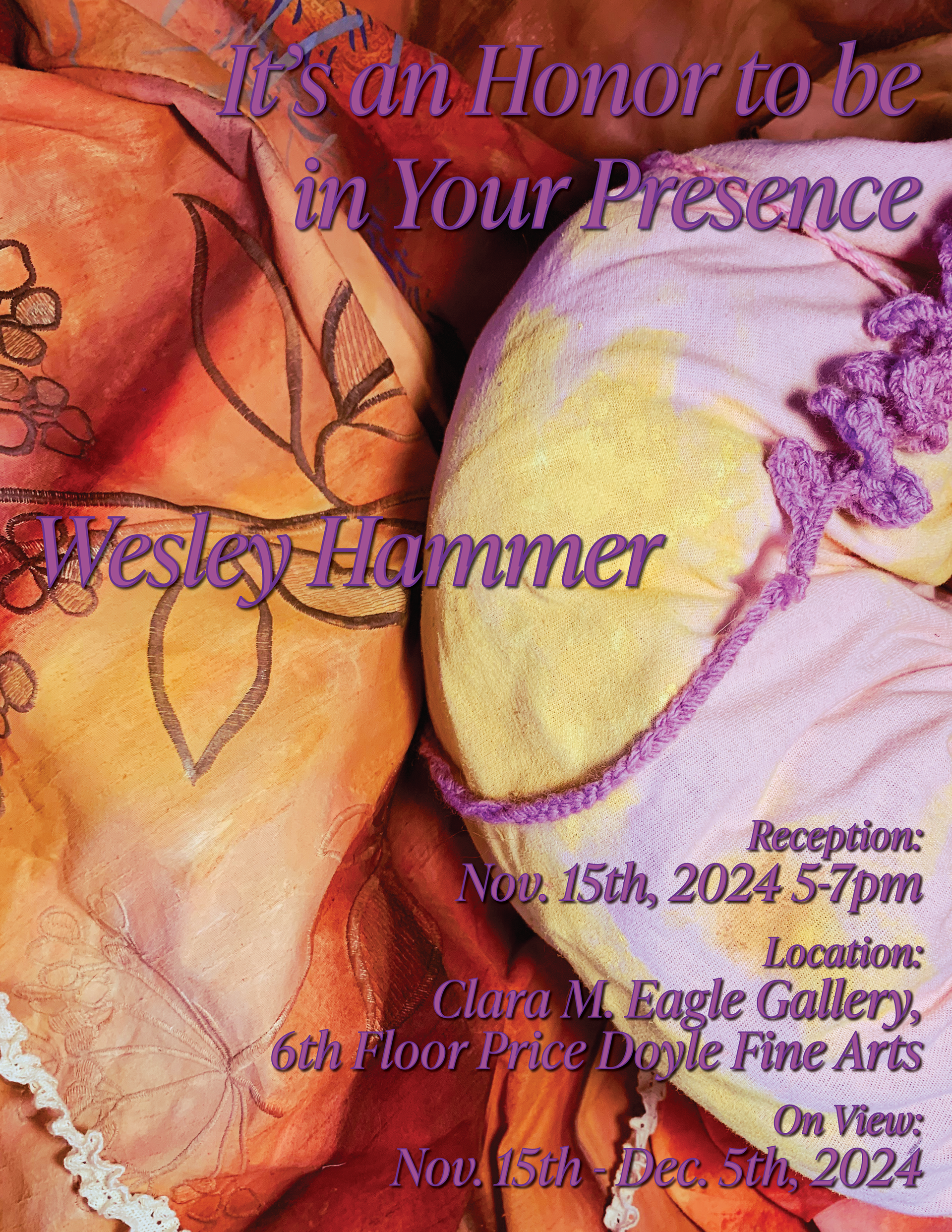
These are my second drafts for this poster. For this next batch of drafts, the client narrowed down some design choices for me, so I continued to work within those parameters. The client also provided me with more images to use as potential backgrounds, so I played around with those as well.
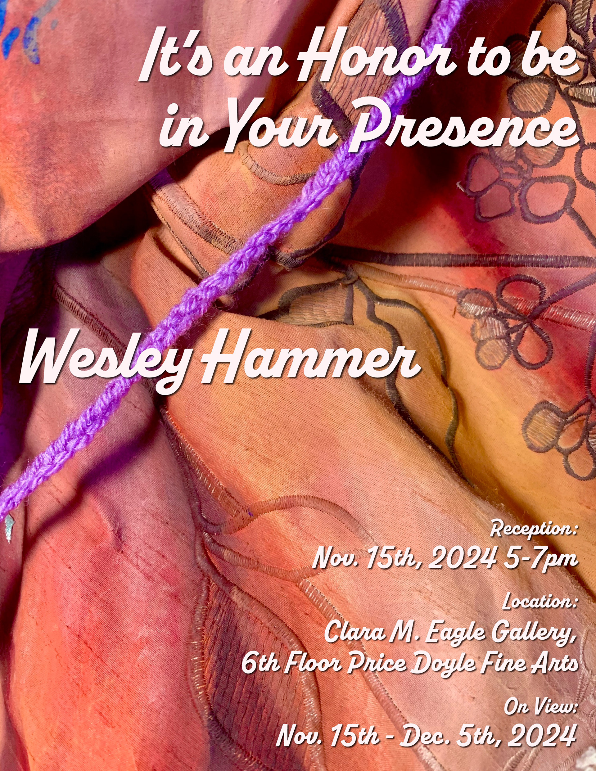
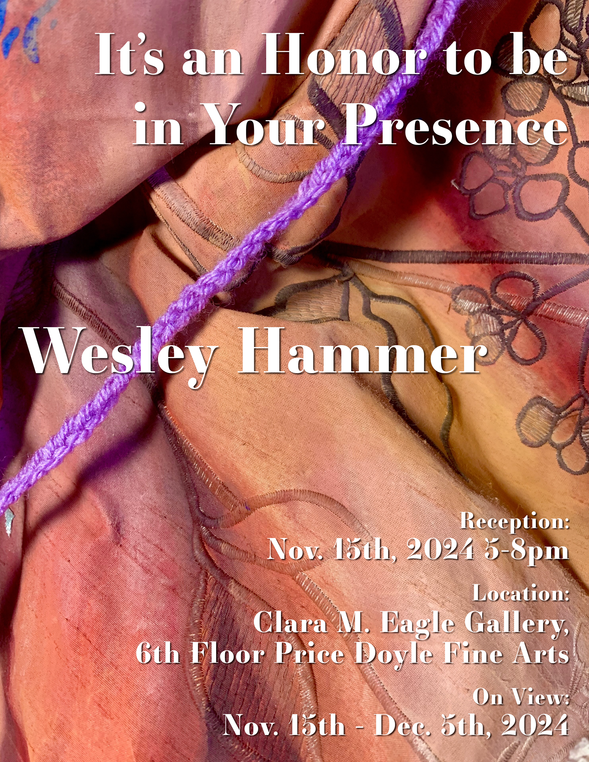
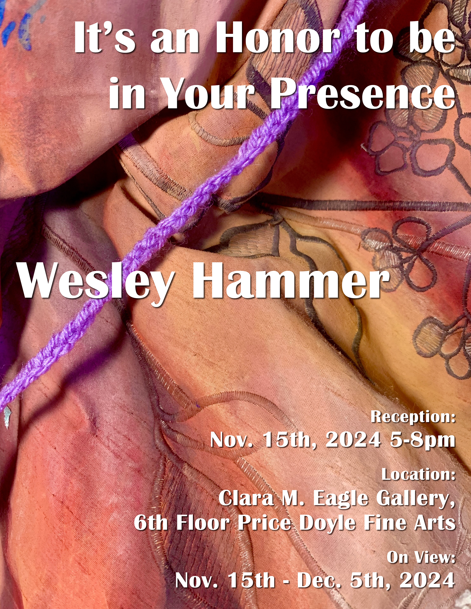
Lastly, these were the final drafts before the client chose the one shown at the top of this page. I had narrowed down the best photo to coincide with the text, as well as the text composition. I tested out more fonts in these drafts, as we didn't have a chosen font yet, so that is what I prioritized.
