Some Company
Instagram Advertisements.
Client: Student Project
This was a branding project for a made up company named Bubble Tea and Juice Company. My goal for the project was to create an Instagram Ad to advertise this company that had successful typography, depth, composition, and color scheme. I went through many iterations, as shown below, until I landed on the design I believed met my criteria.
This is the final iteration of this project. I made many designs and tried out different colors and compositions until I created this piece, which I felt was the most successful out of all of them. For this final edition of my Instagram ad, I put together the proportions of two Instagram images to make one complete piece. To fit this piece in with how it would be displayed in an Instagram format, I had the type fit within the proportions of a singular Instagram image, but used the illustration as a bridge to connect the two halves of the complete image together.
Mockups
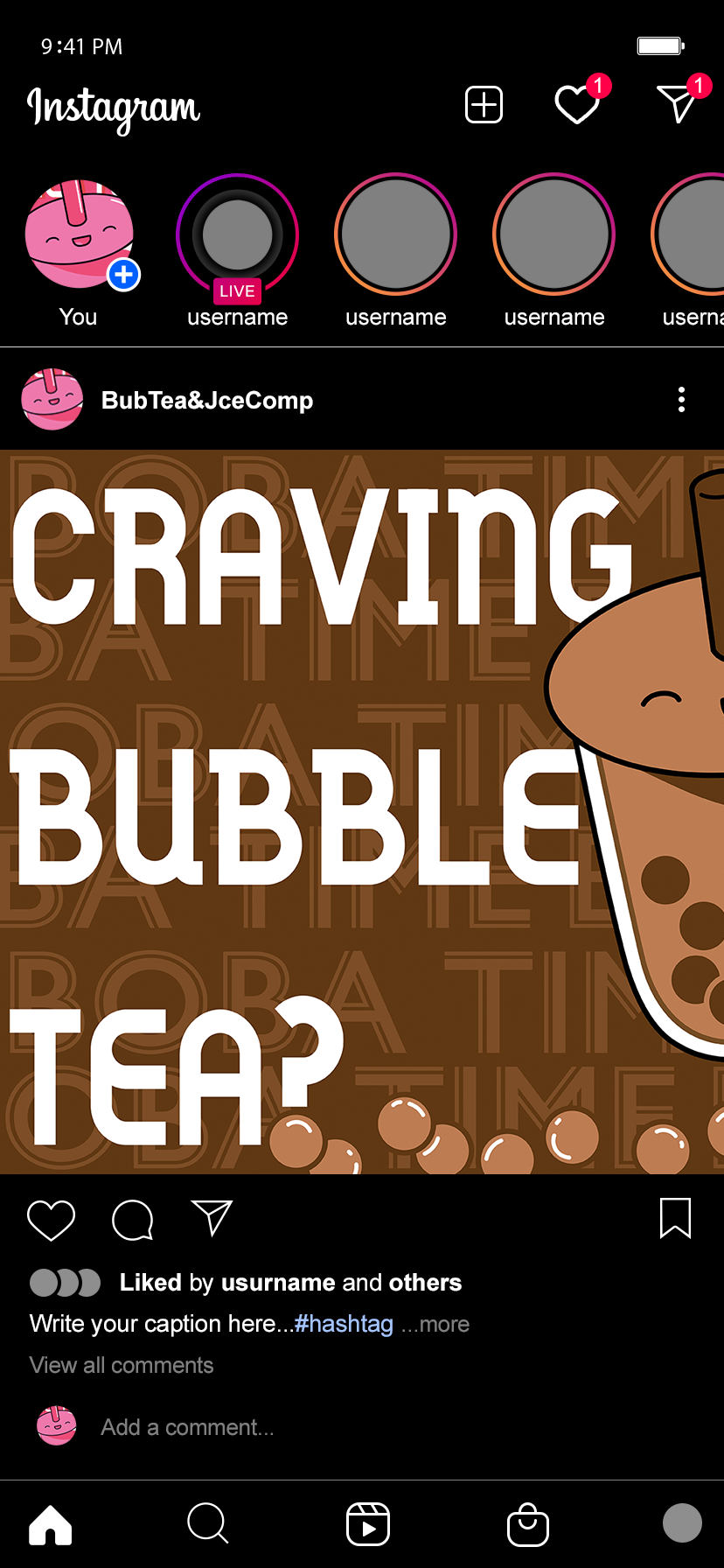
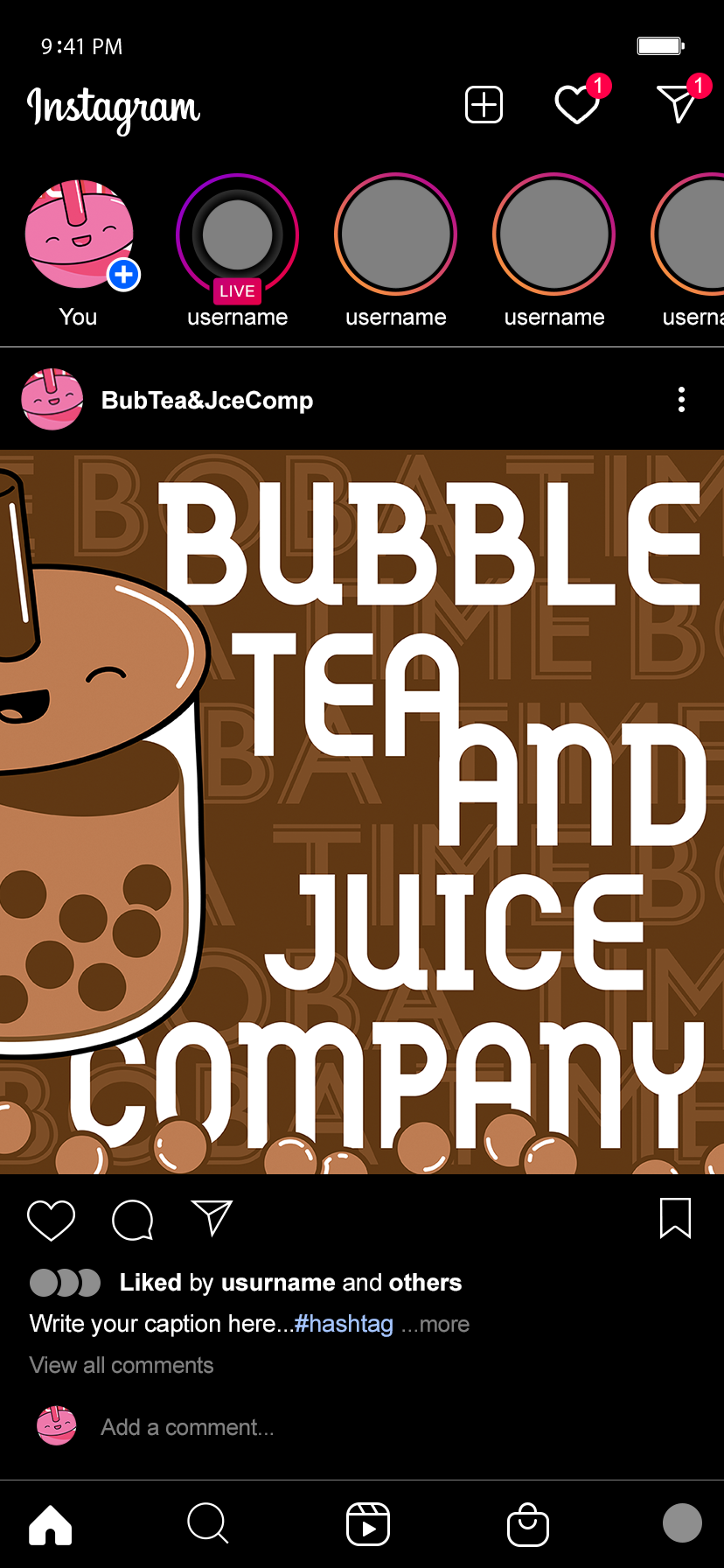
These are two mockups I created to represent how these ads would be viewed on Instagram. For this display, I’ve placed them side by side to display how the ads would be read as one image when posted. My composition allows the viewer to recognize that the ad continues and that they need to swipe right to see the rest of it. I created the piece to be presented this way because, on Instagram, it is easy to miss that a post has multiple images that you can scroll to and not just one. Leaving the illustration cut off not only allows the viewer to recognize that there is another image, but it also makes them curious to see the rest of the image, and this mockup shows that.
Process
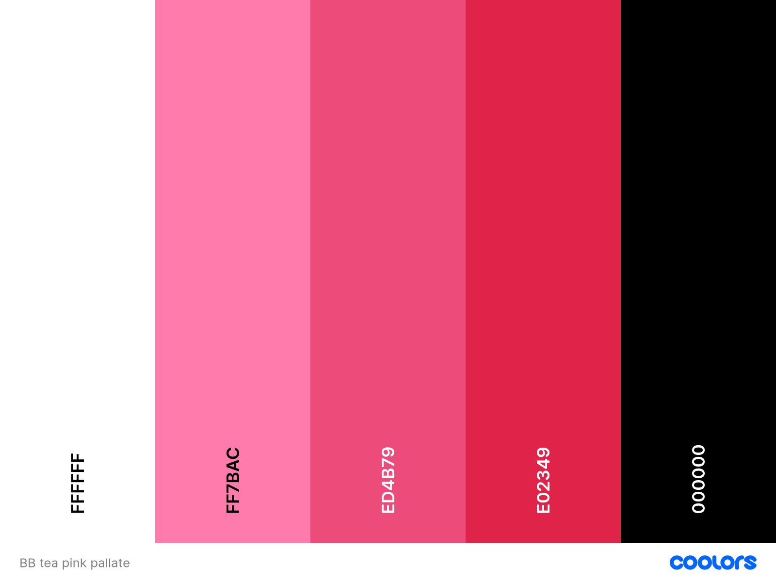
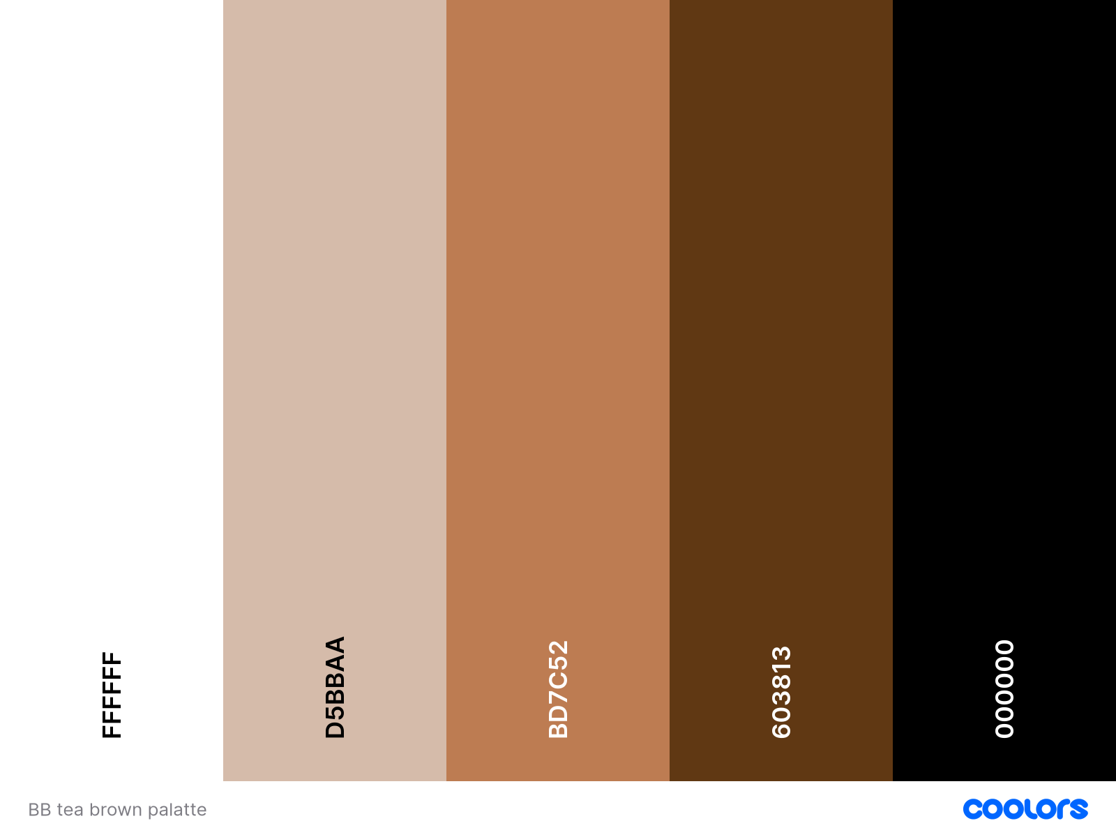
These are my color studies for my Instagram ads. The left version was the first color study I did where I picked out mostly bright shades of pink in order for the ads to have a fun and exciting tone to them. On the right, and more finalized, color study, I changed the pinks to browns in order to have a more muted and less jarring color palate.
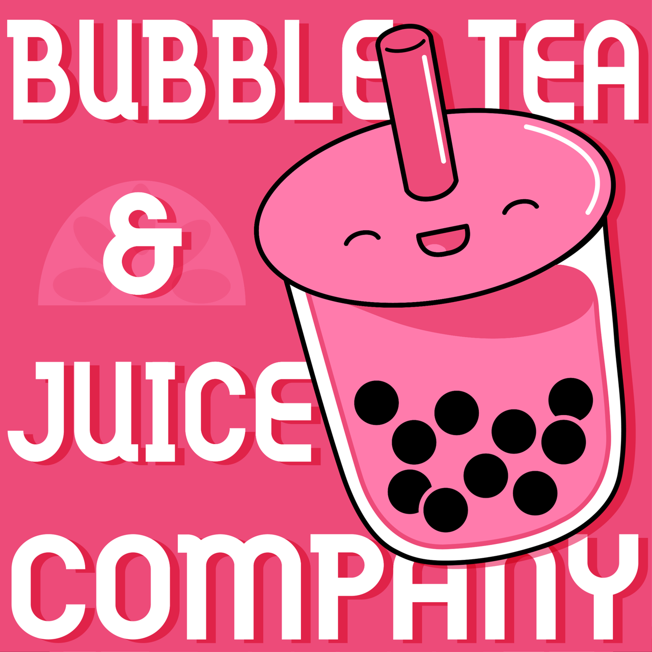
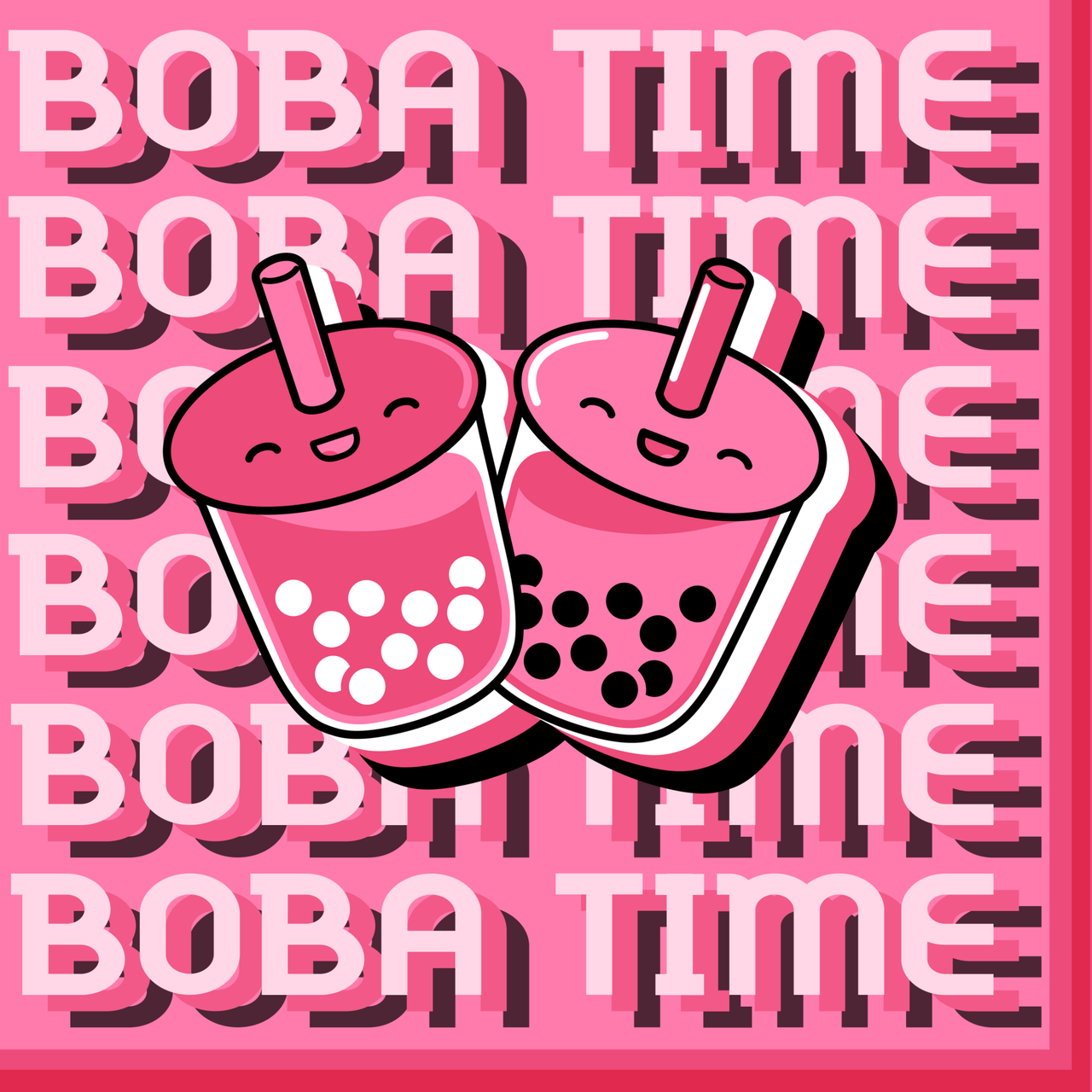
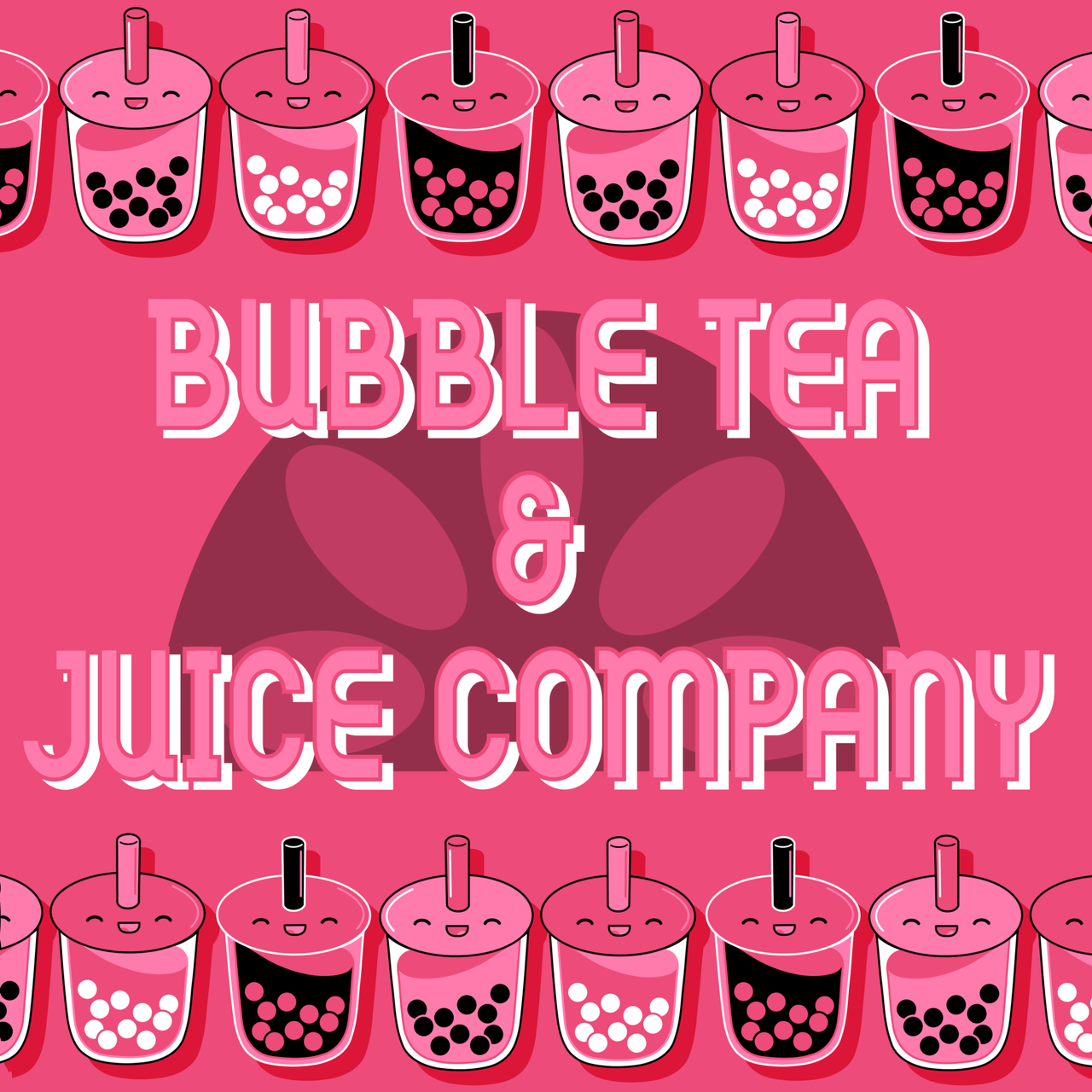
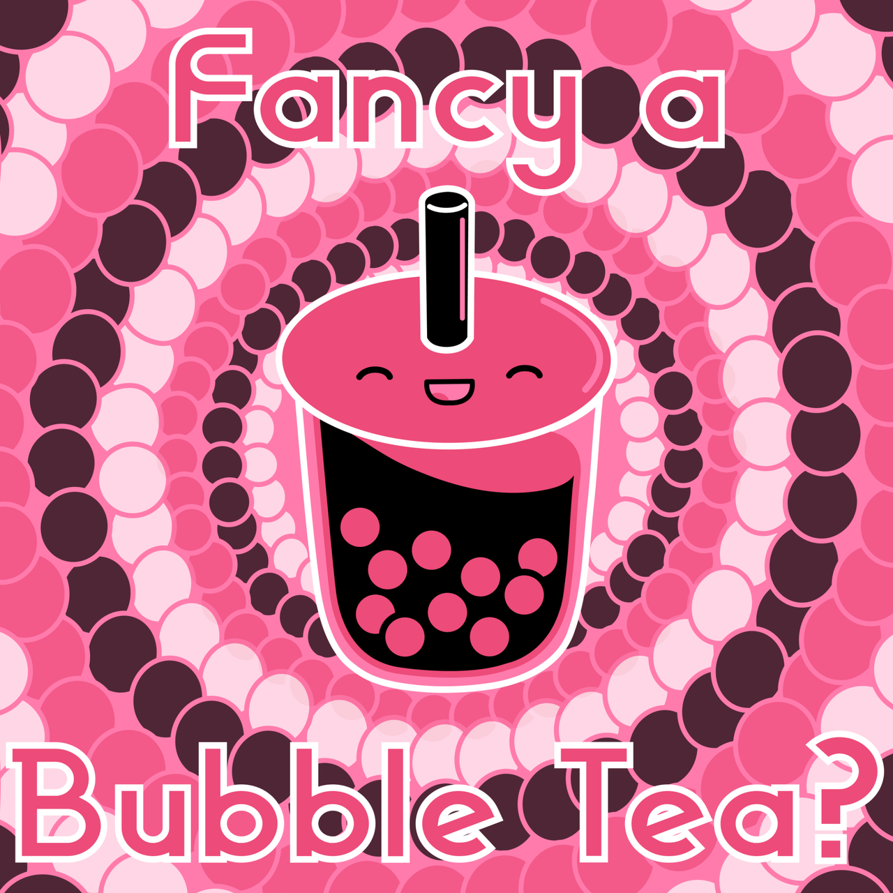
These are my initial designs for my Instagram ads. I played around with different compositions, colors, and patterns in order to determine what was most successful. For the first design, I wanted both the image and the lettering to interact with each other and to create depth. I also used the bright pink as my color scheme to start off with. Continuing to use pink in the second design, I wanted to further play with depth for this image by using multiple shadows and by making my text more transparent and laying my illustrations on top of my text. In the third design, I wanted to play around with how pattern would compliment the illustration, so I used the same circles from my illustration to create a background pattern. Once again, I tried using the same shades of pink to play around. For the least design, I wanted to try using the illustrations as a background element or a pattern, rather than a centerpiece. I tried putting the text front and center to create some hierarchy.
For this edition of my Instagram ad, I tried to play around with pattern and composition, but the stripes ended up making this piece feel too busy. Like my final ad, I kept the text directed towards either side and put the illustration in the middle. However with this piece, the image can be viewed from either half and still appear as a complete image. I decided to use more natural and muted tones in order to give off a more mature, yet still joyful feeling, as I felt that the previous bright pink might’ve been too jarring—this change is what led me to create the final version of my Instagram ad.
