A series of potential
logos for an equipment company.
Client: Taul Equipment
I created a series of potential logo designs for Taul Equipment when they came to me with the desire to change their previous company logo. They were unsure with what they wanted, so I provided a variety of designs that range in the themes they were interested in to show them the different options they could go with.
This design was the overall favorite of the Taul Equipment marketing team. The owner of the company really wanted a "spring green" to be apart of the logo and he also wanted a tree/plant element. This design includes both of those wishes, as well as includes the year the company was created and solid, bold lettering to act as a callback to their previous logo. I also used color, shape, and space to create depth and a sense of movement between the outline and the lettering.
Earthy Variety
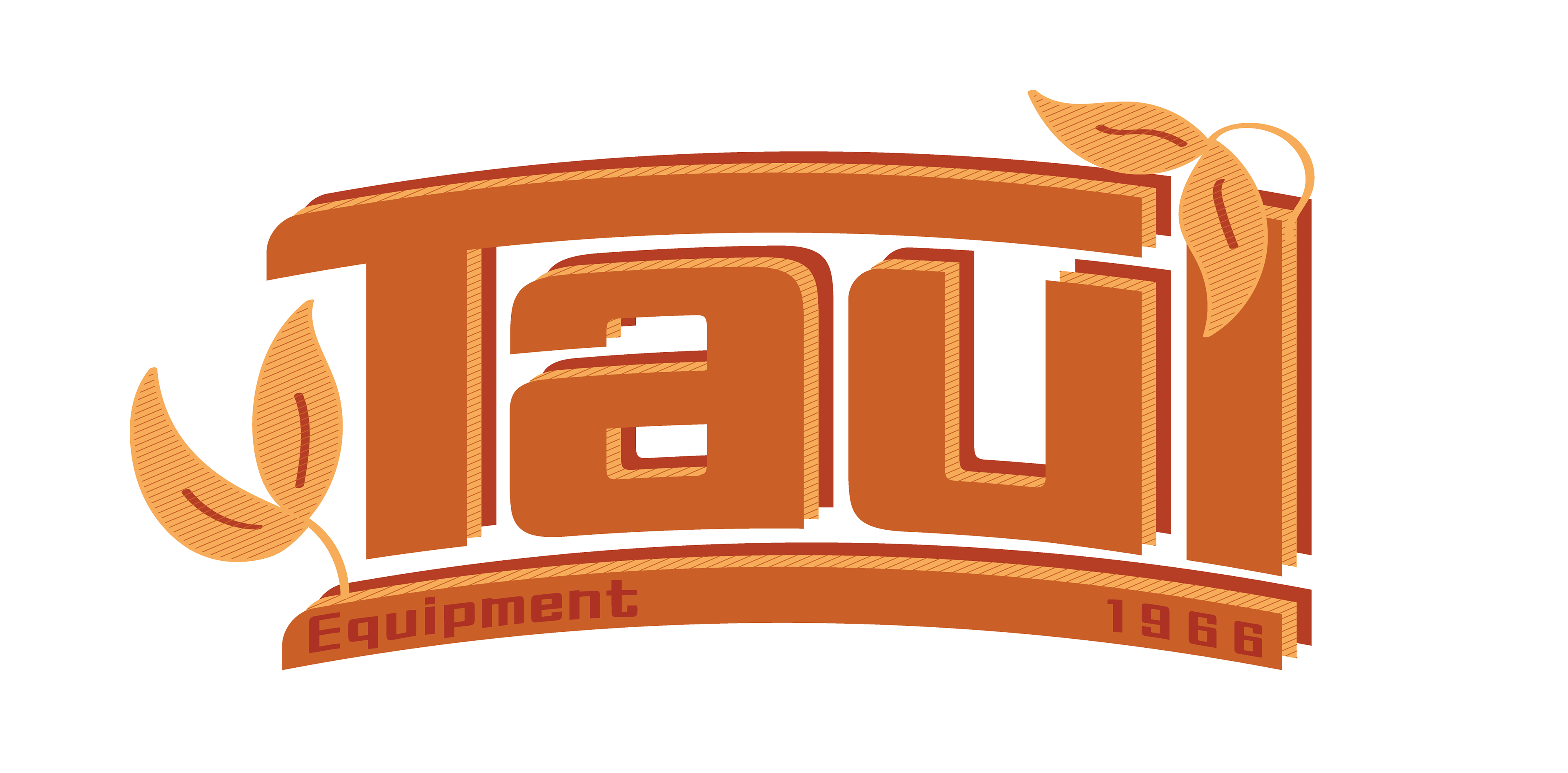
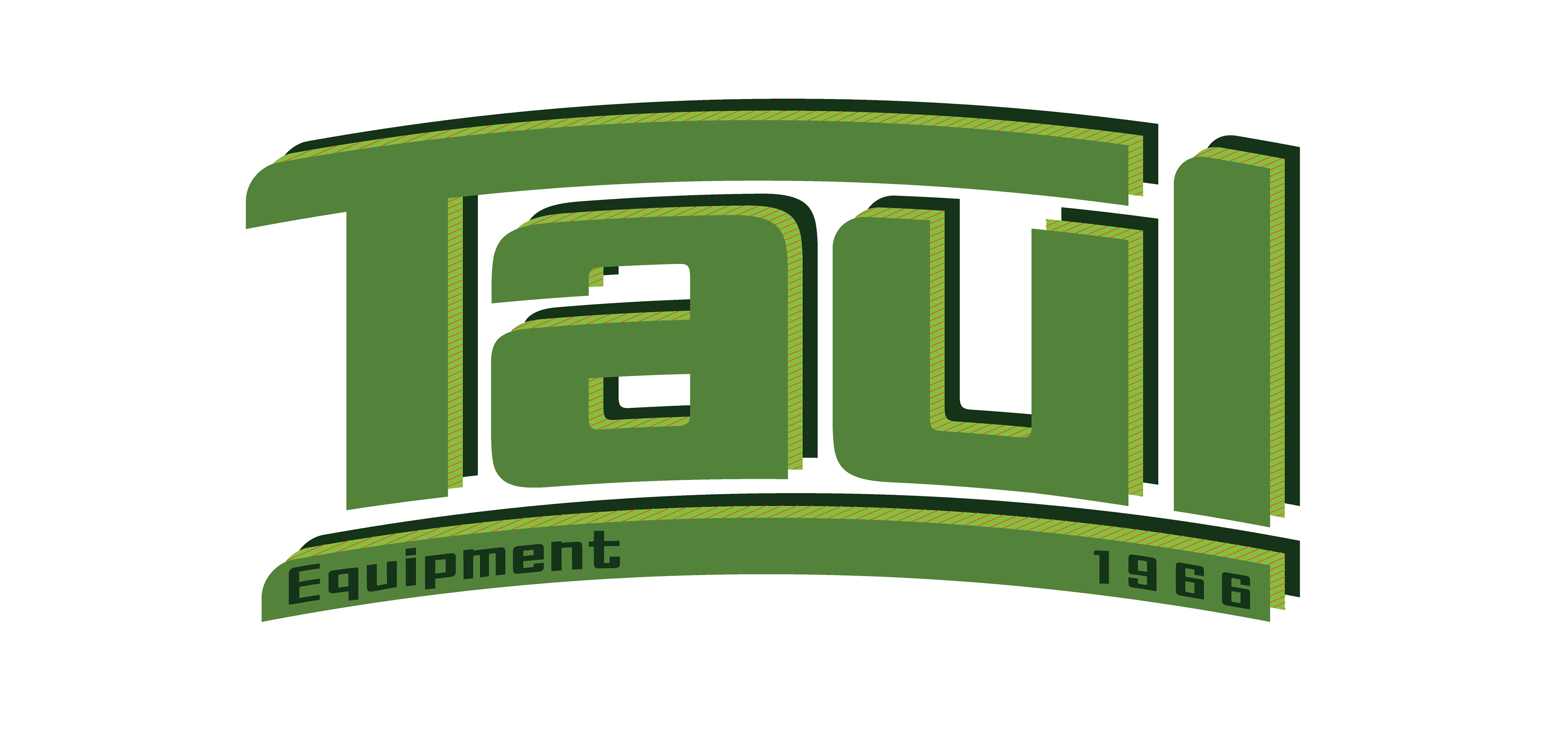
These designs all feature elements of earthiness in them. Taul Equipment was branching into including summer vacation products into their company and wanted elements to represent that shift. The use of brighter colors, including an earthy green, really help to add to the summer aesthetic, as well as the small notes of plant-life throughout all of the designs.
Sharp Variety
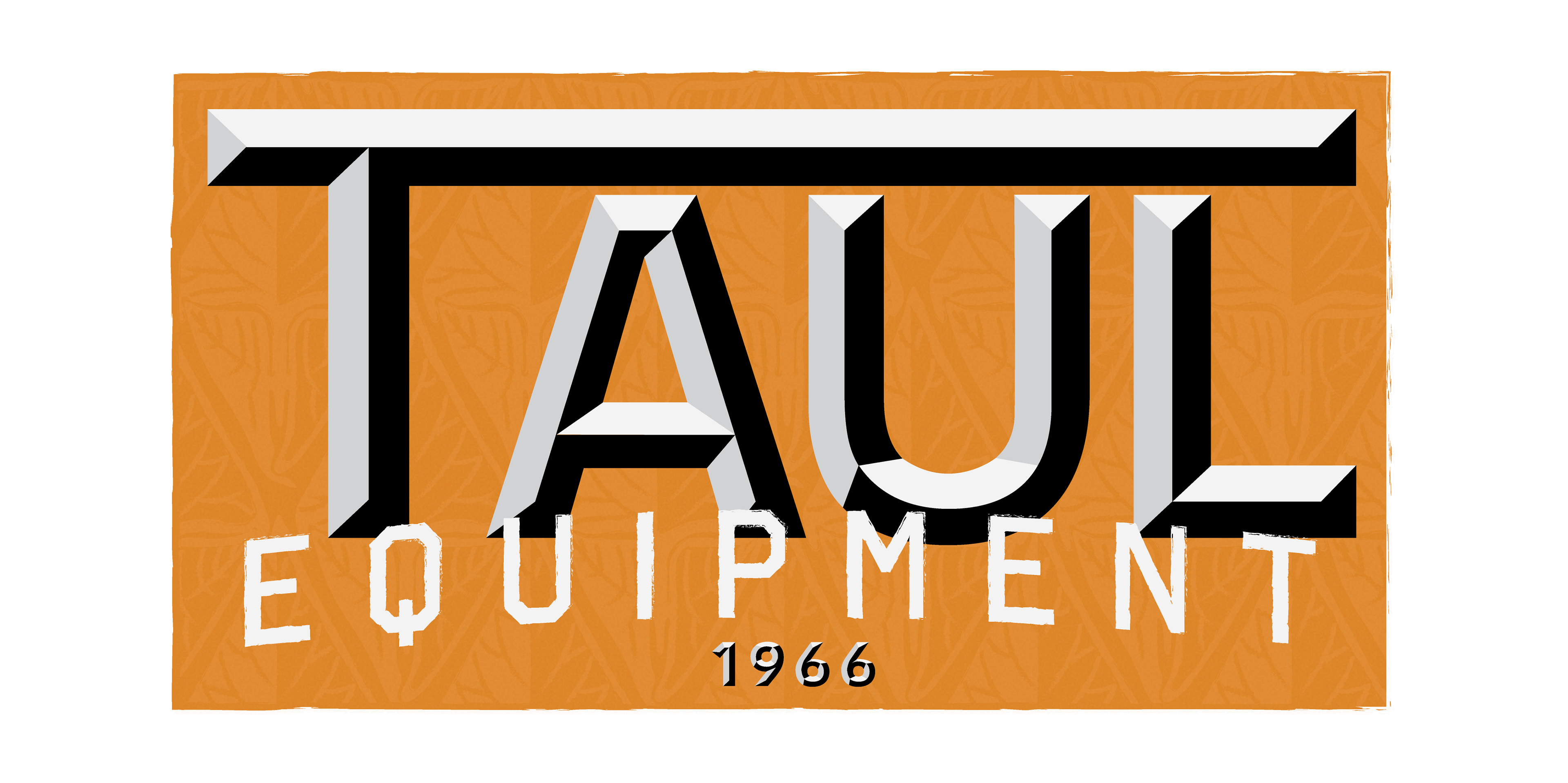
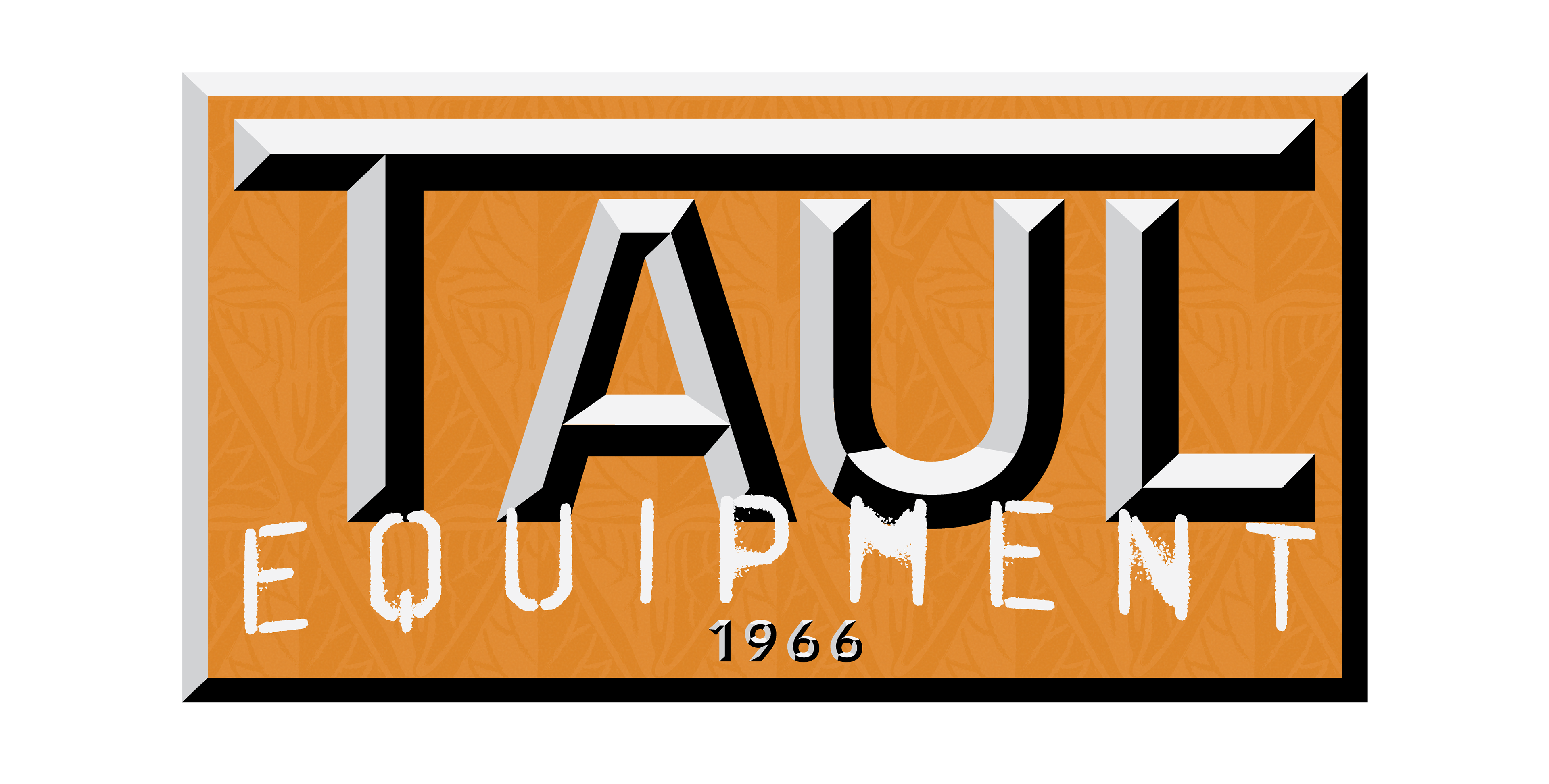
These designs feature more mechanical and sharp qualities. I wanted to pay homage to their previous logo that they had for many decades, where the lettering was very metallic, so I featured more mechanical elements. In some of these, the backgrounds for the logos were made to look like they were sitting on a metal plate. The color scheme is much warmer for these designs than in the previous ones, and the small elements of texture in these designs were added to add contrast.
Process


These were the first four designs I created for the company. I played around with different ideas and elements we talked about in our first consultation and tried to see what worked and what didn't, as well as what ideas I wanted to lean more towards to give the marketing team a direction to look towards.
This is one of the sketches I did that was the basic groundwork for the different designs I created. This sketch was also created with the main inclusions that Taul Equipment wanted for their new potential logo.
