Menu Designs for
a wedding.
Client: Katherine and Patrick Taul
These are menus that I created for a wedding event. The fonts and colors match the previous invitations and save-the-dates I made for the couple to create unity. I also prioritized space and composition on this work to ensure the text was easy to read and to make sure it didn't get too busy. I also used color to further aid with legibility and to make certain elements more pronounced.

Process
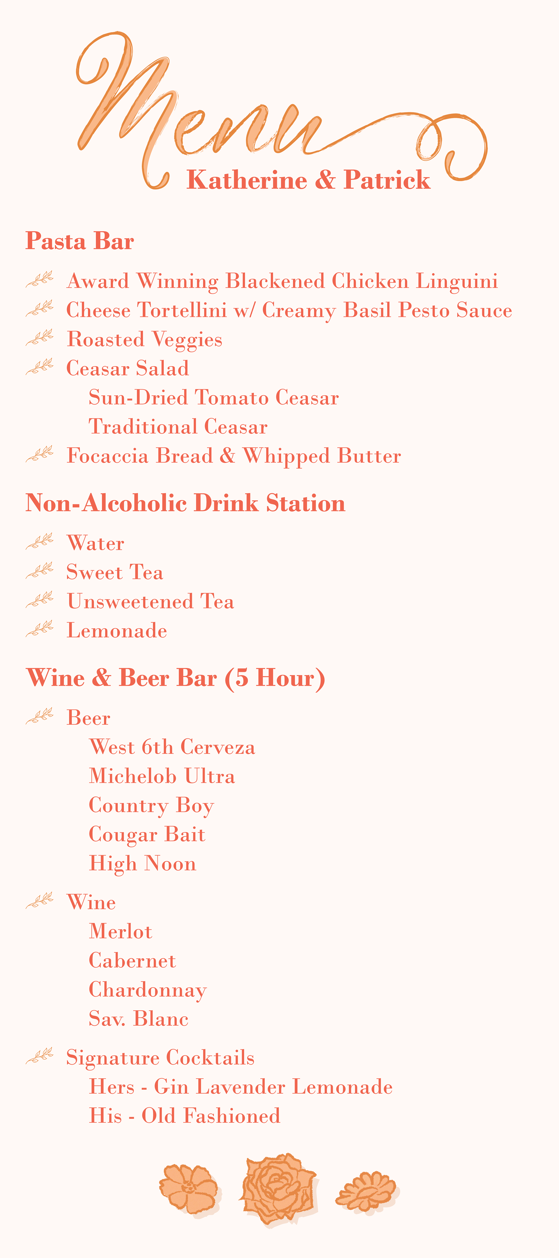
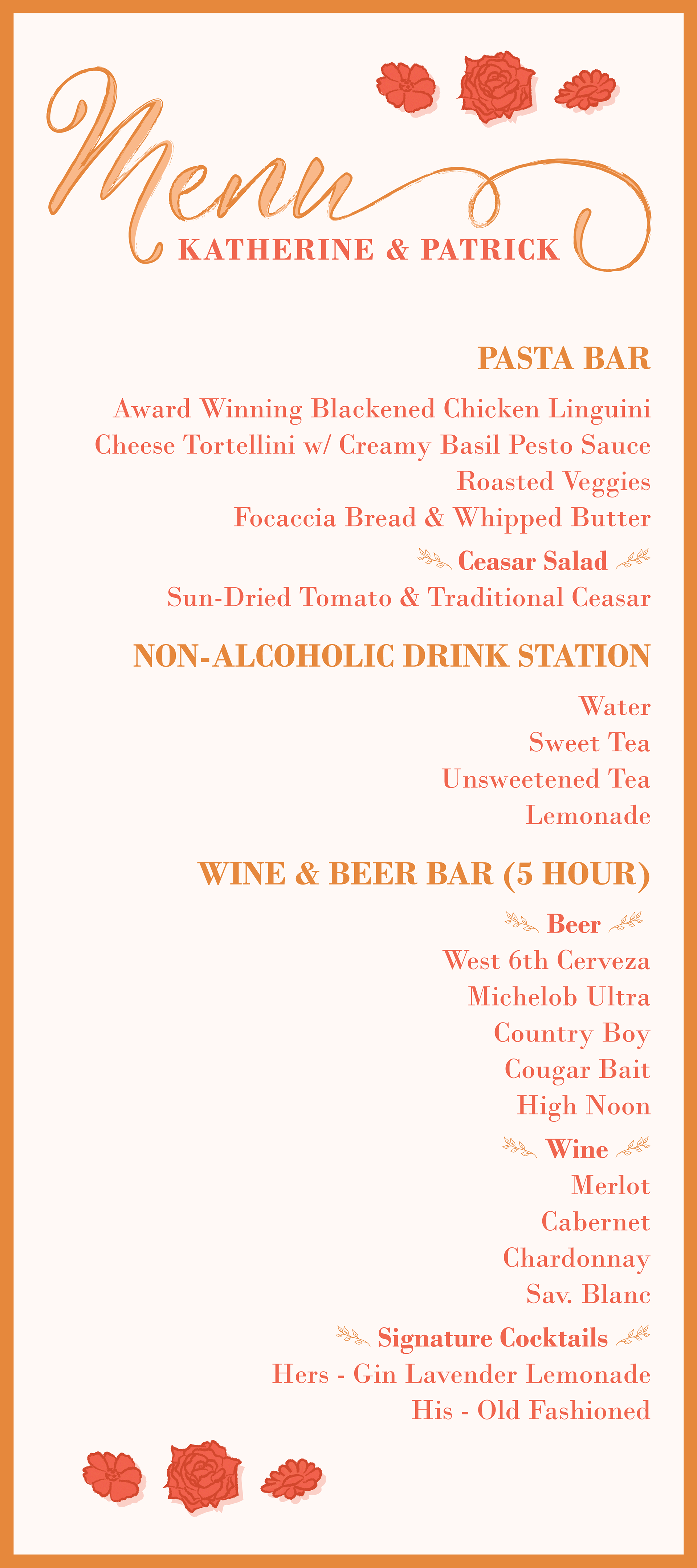
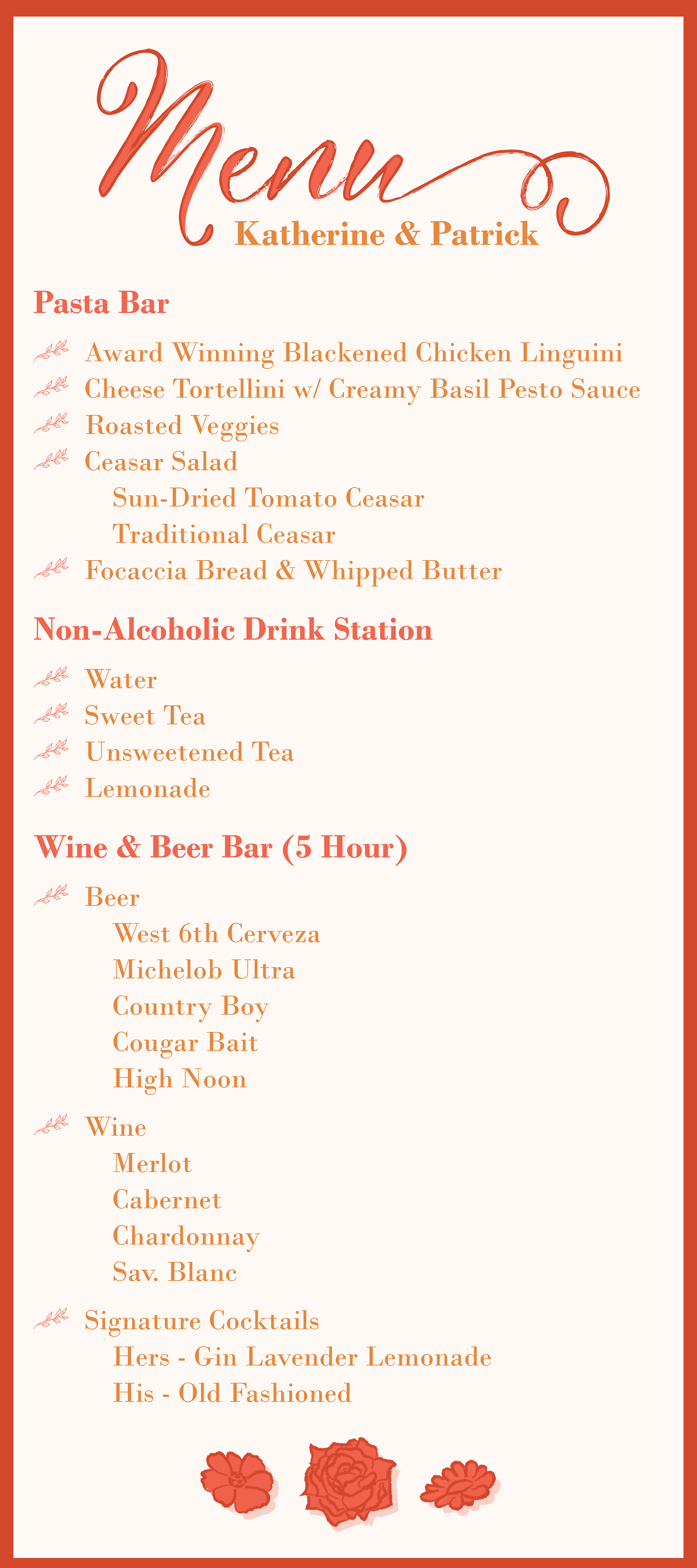
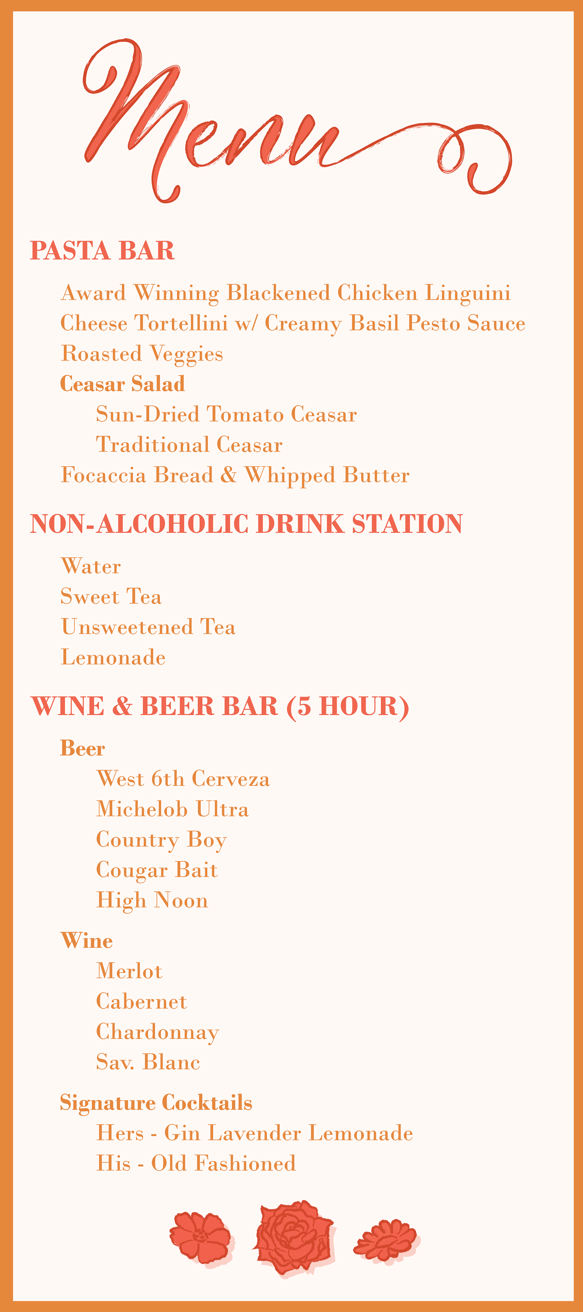
These are my first drafts for my clients' wedding menu. I focused on offering different compositions so the client had different options to choose from. I used the same color scheme and fonts on these designs to provide unity between the menu designs and the wedding invitations. I also tested out different text options such as capitalizing complete lines to add contrast to the text to improve legibility.
