Invitations and Save
the Dates for a wedding.
Client: Katherine and Patrick Taul
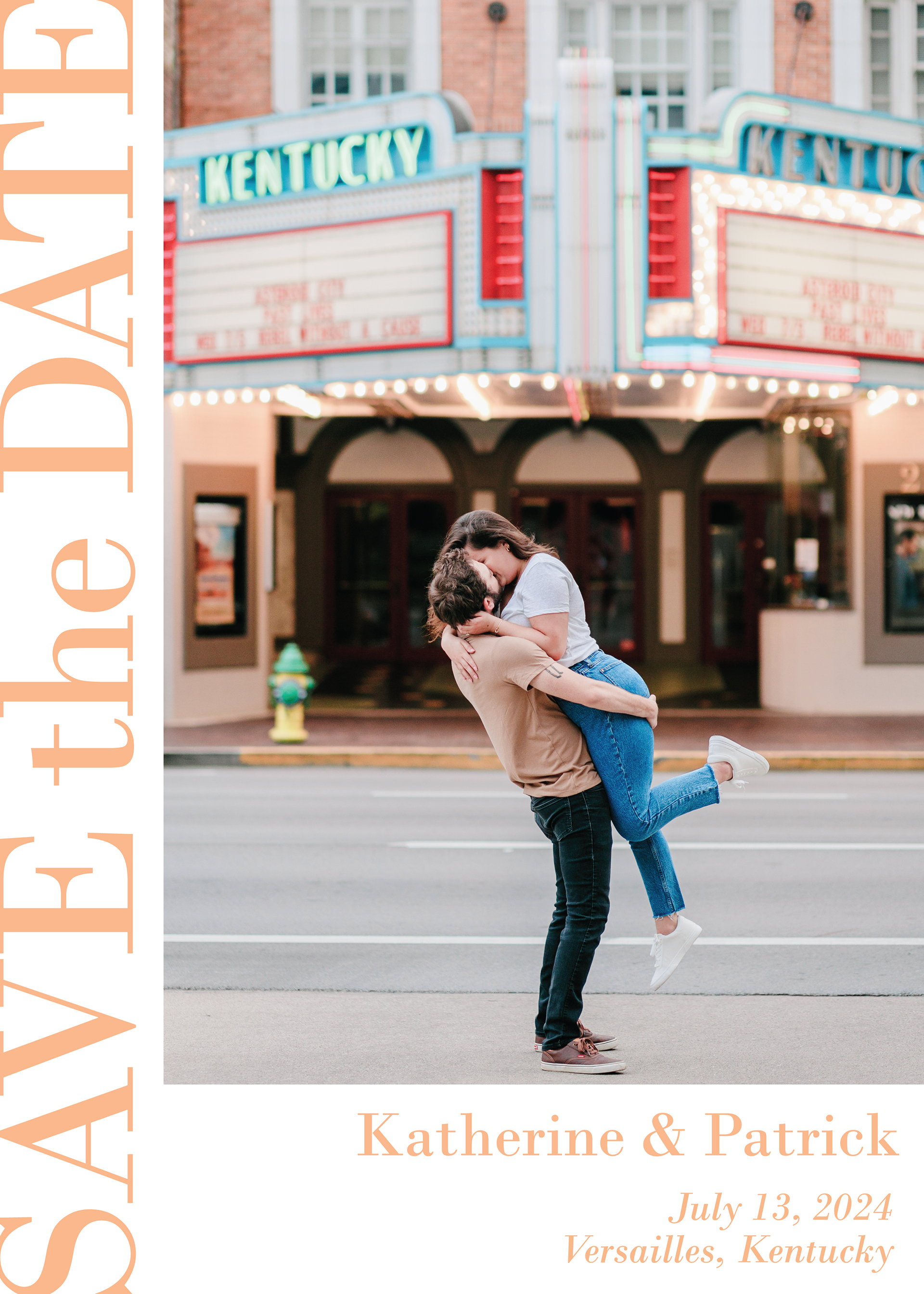
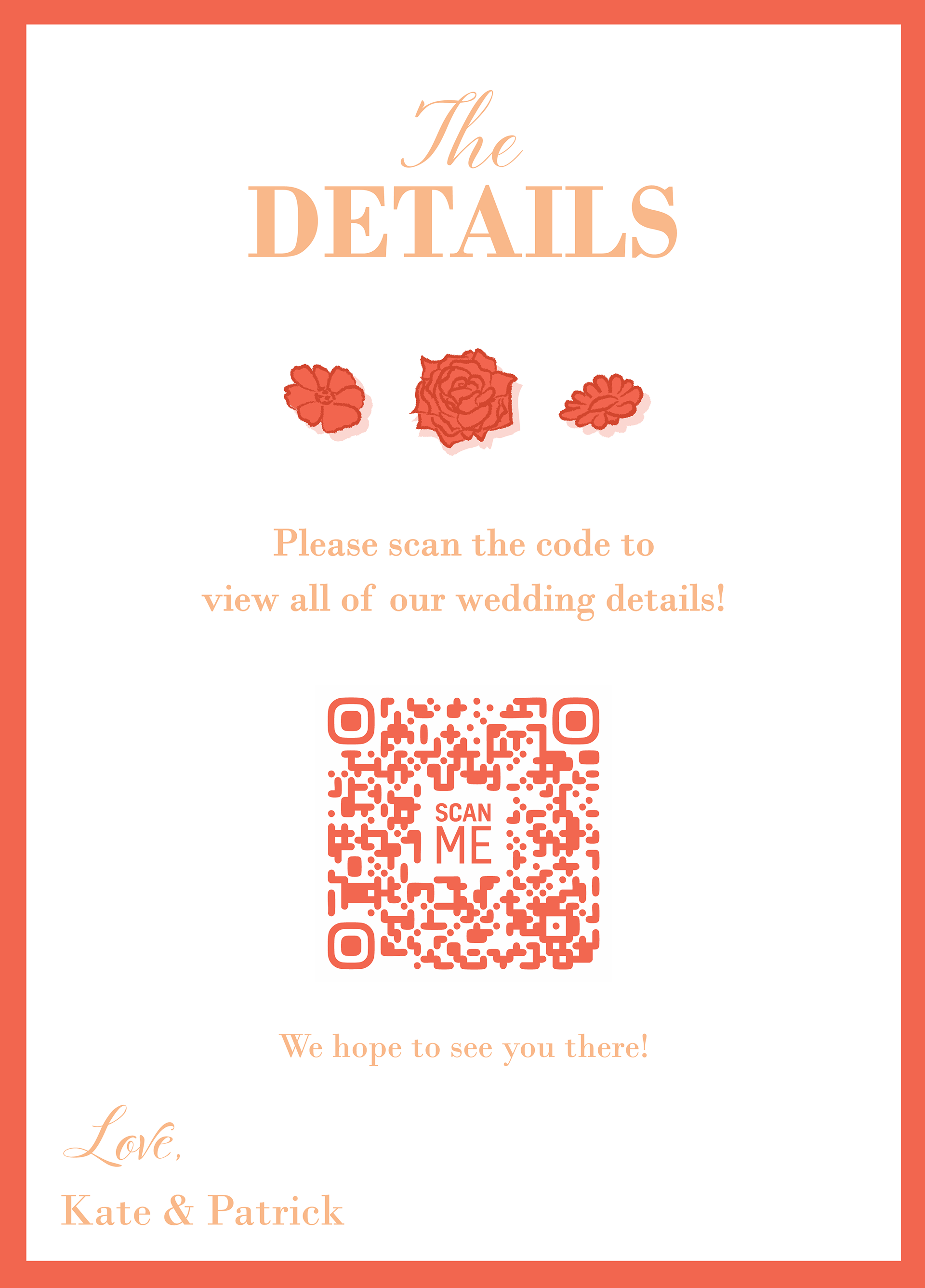
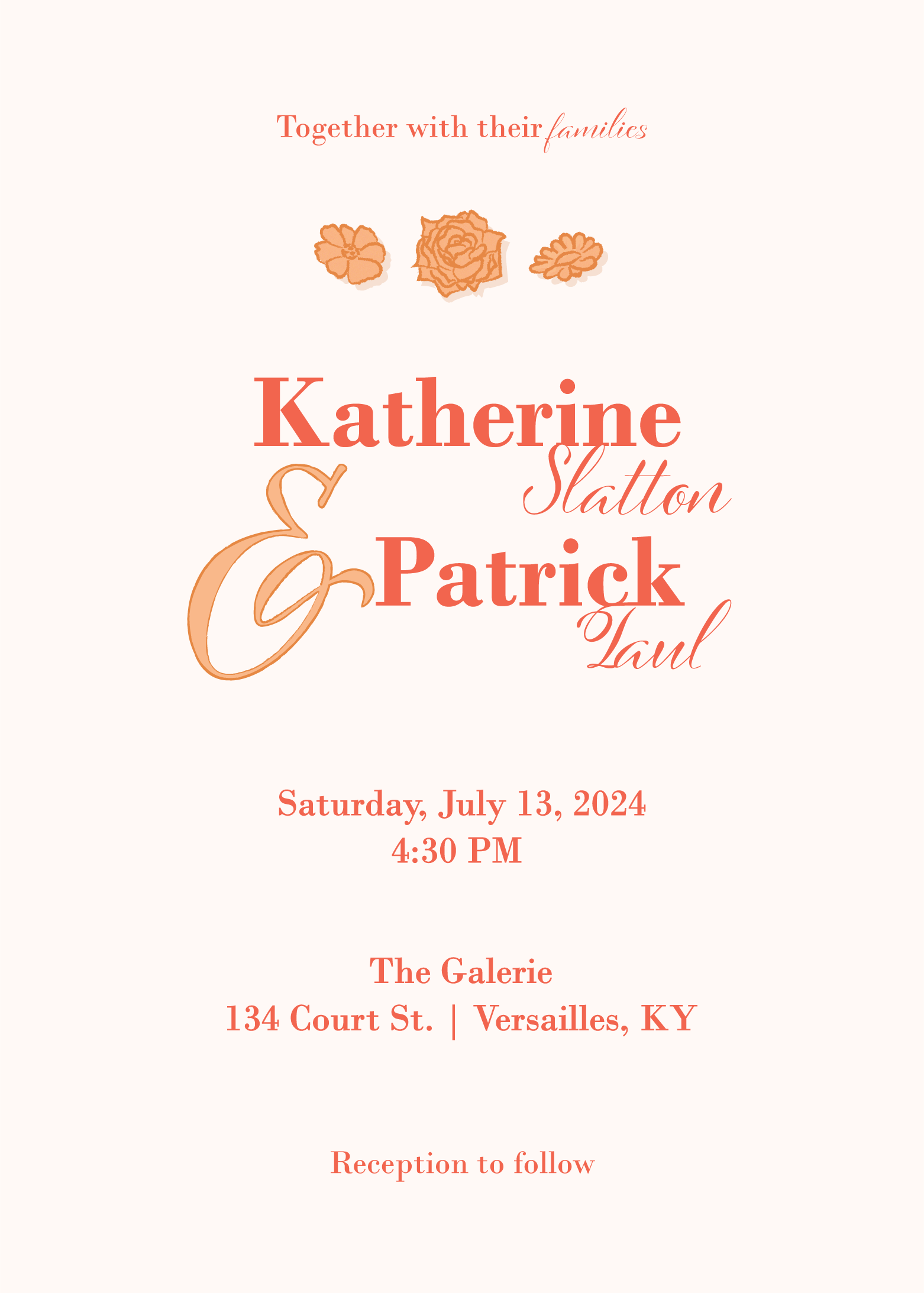
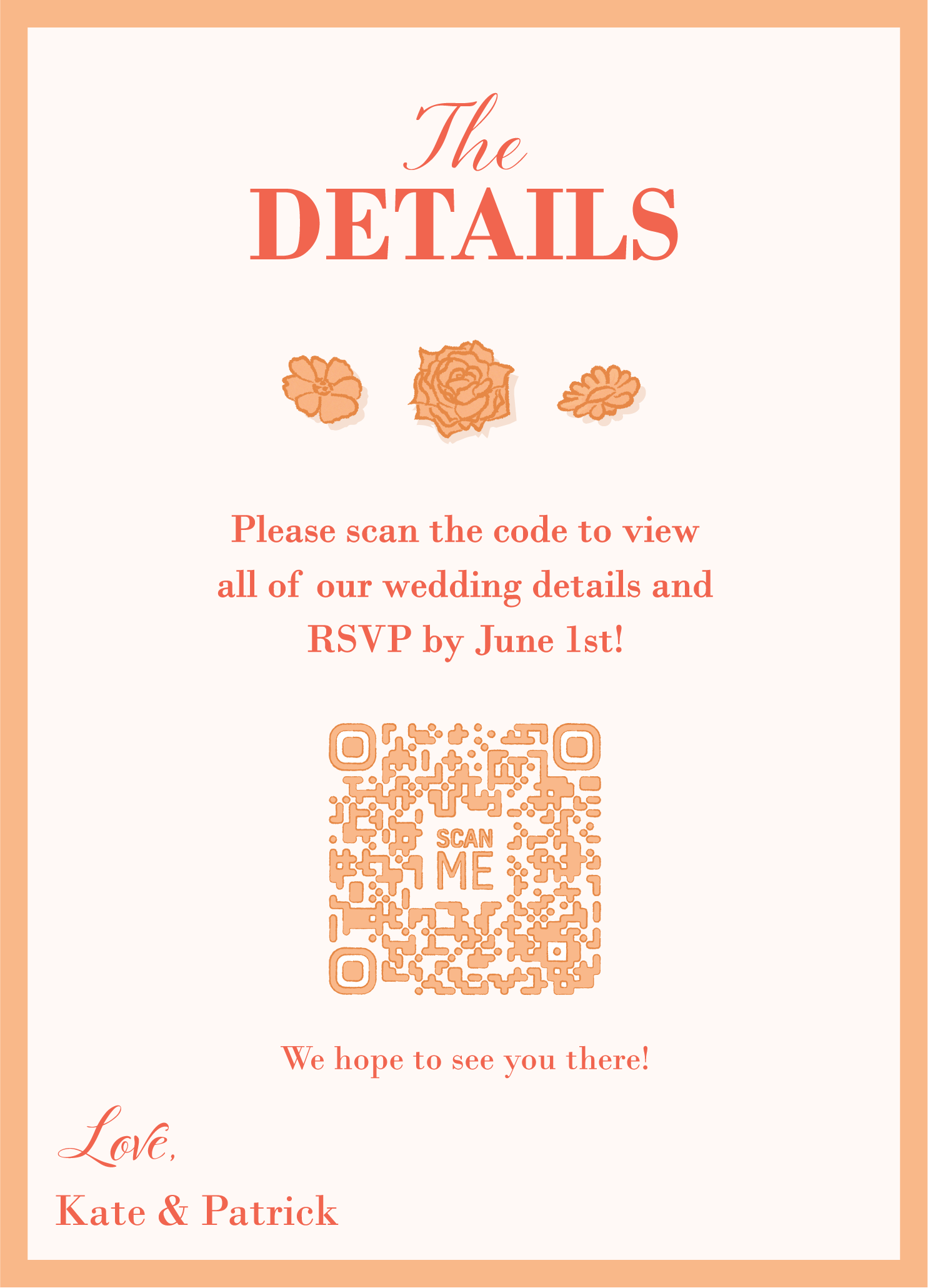
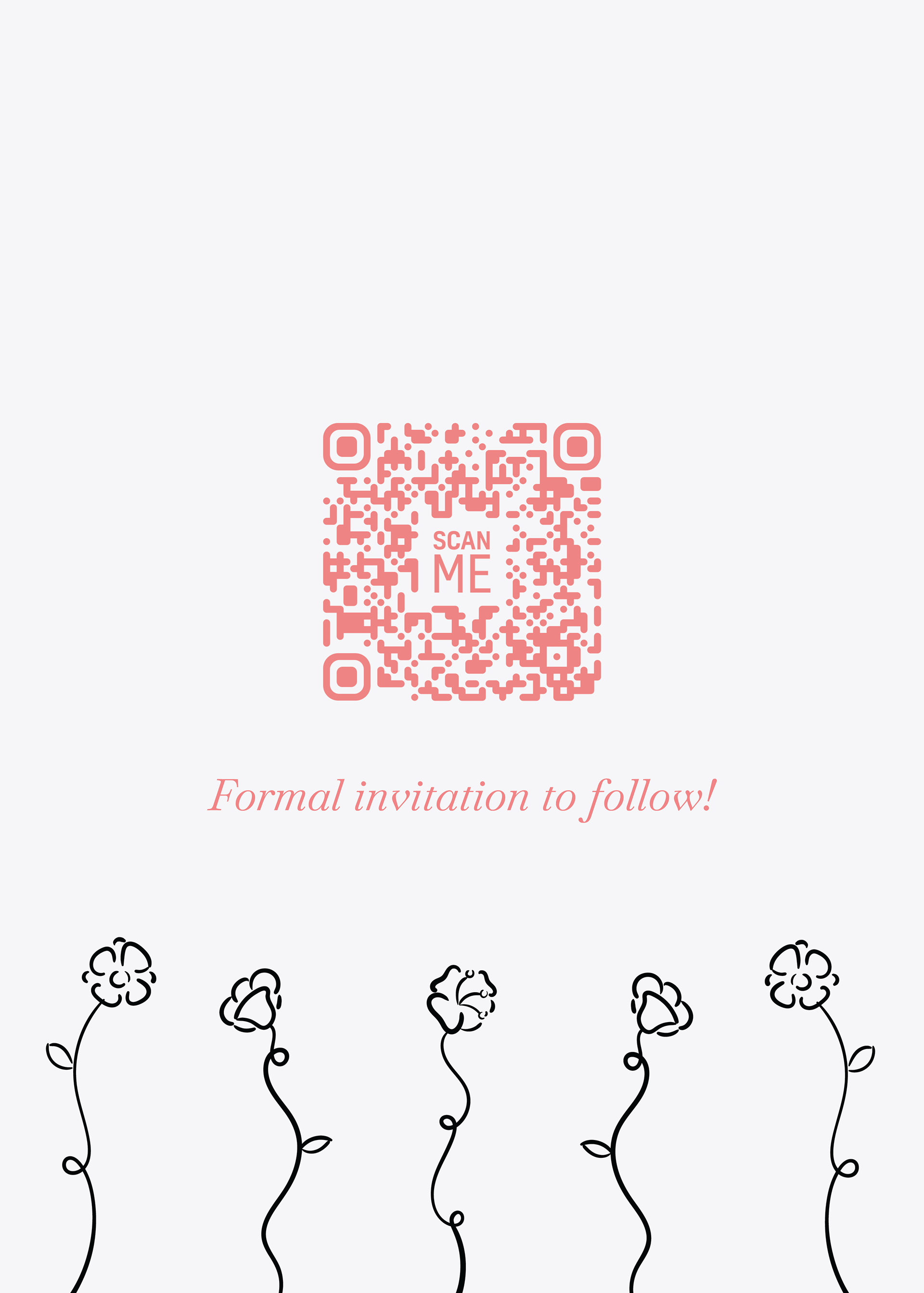
These are invitations and save-the-dates that I created for a wedding event. The designs are classy without looking outdated with the inclusion of a serif, script-like font coupled with a bold and clean layout. I also wanted to create unity between the designs for the invitations and the save-the-dates by using the same fonts, colors, and design layouts.
Save the Dates
Invitations
Process
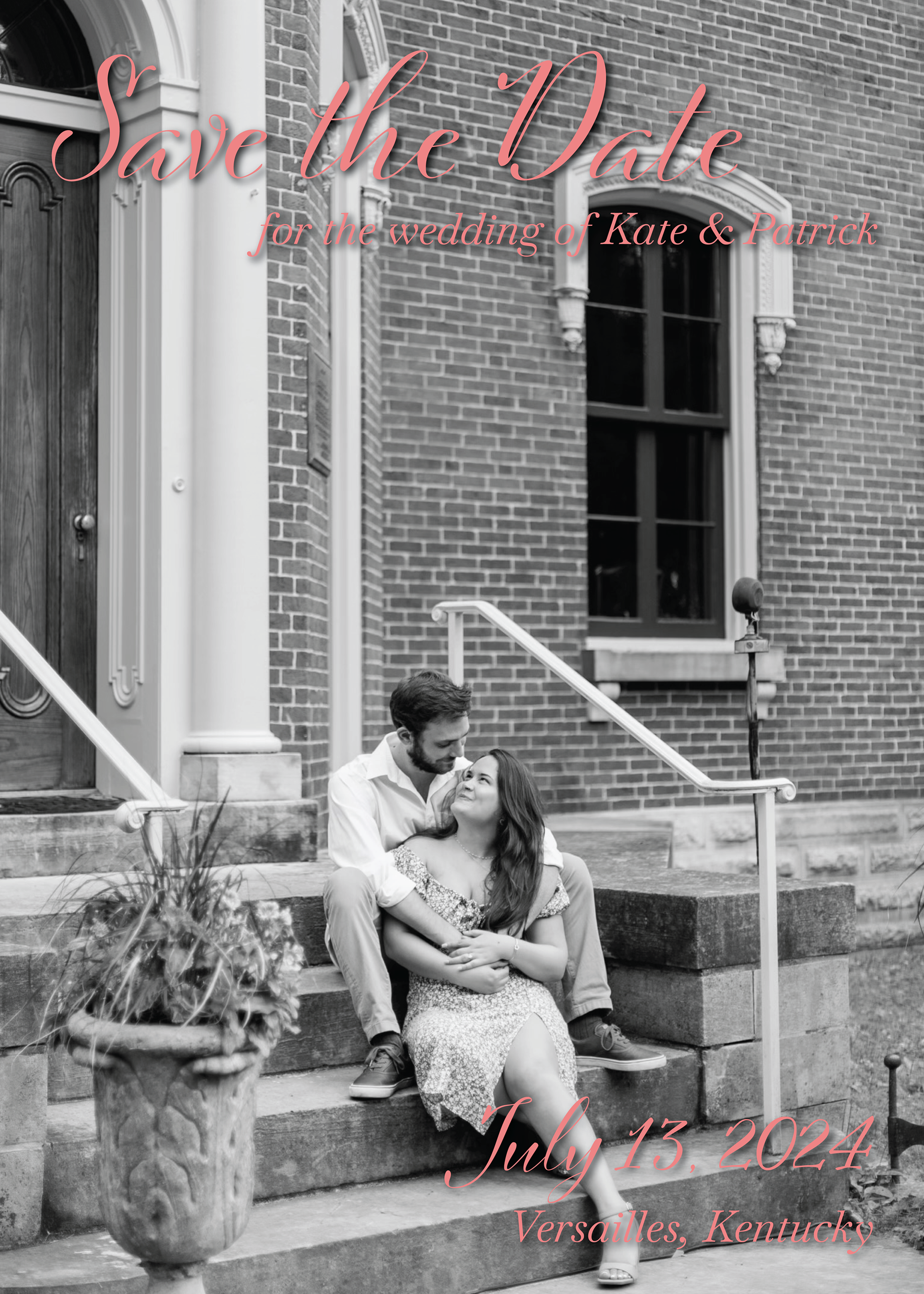
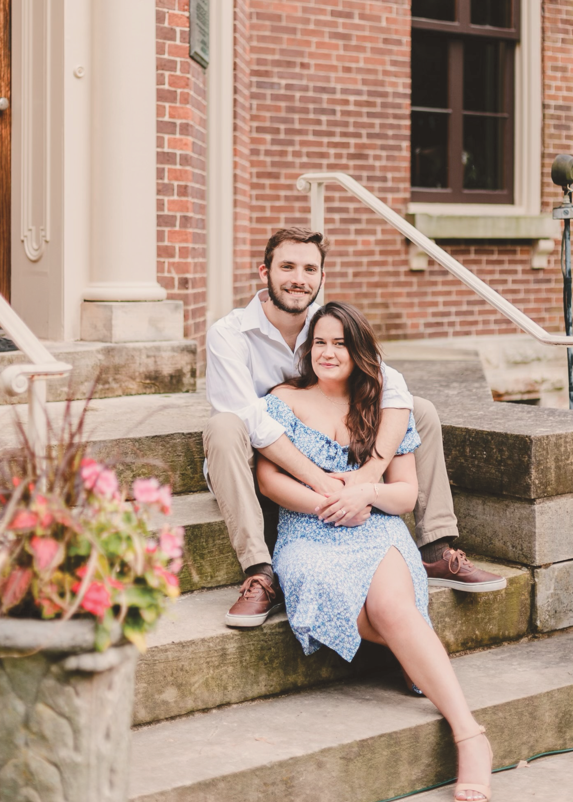
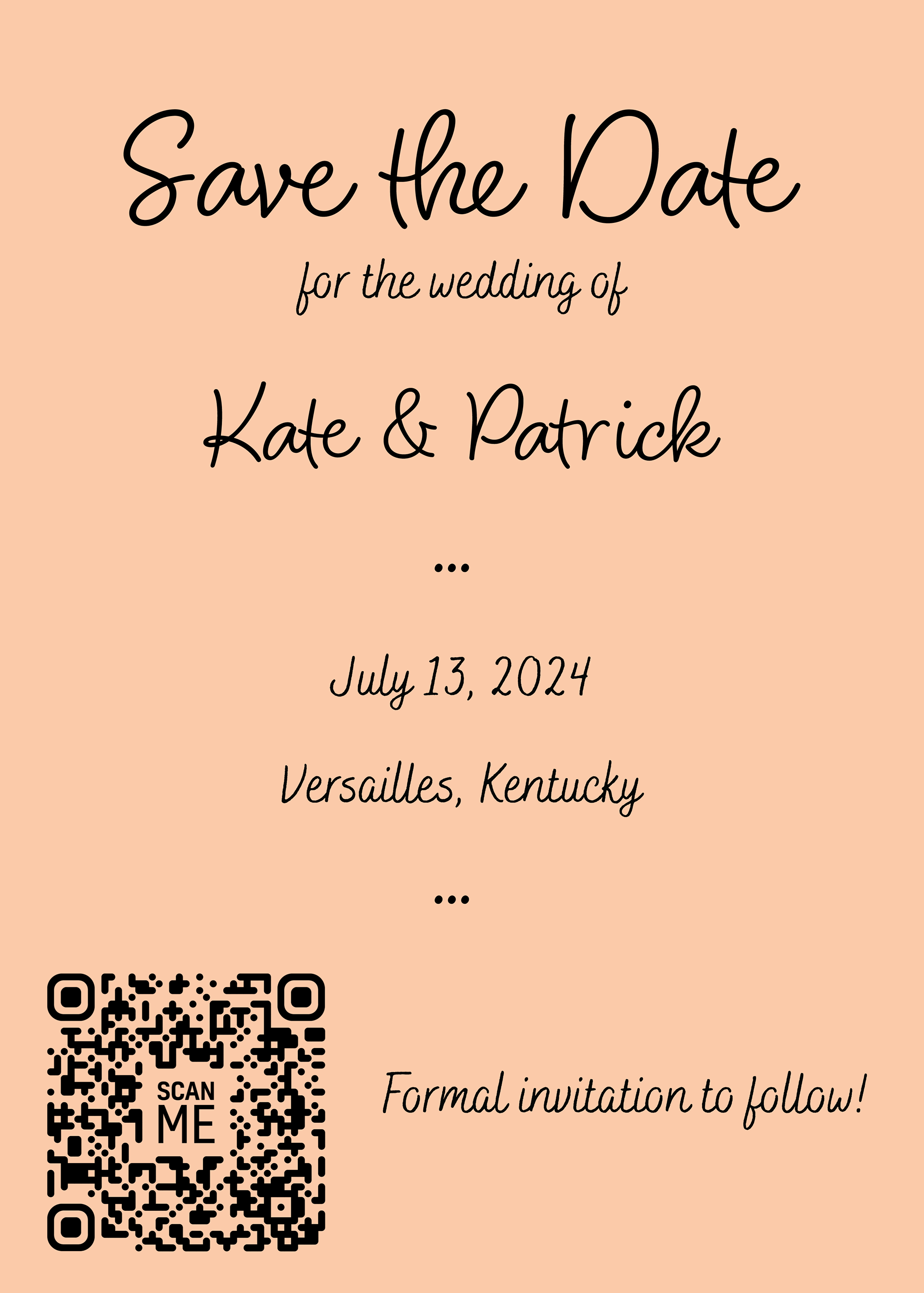
These are the first drafts I made for the Save-the-Date invitations. The client sent me some photos to use, which I edited to create unity for different themes I wanted to test out. I emphasized color and space for these drafts to emphasize the text and photography of the designs.
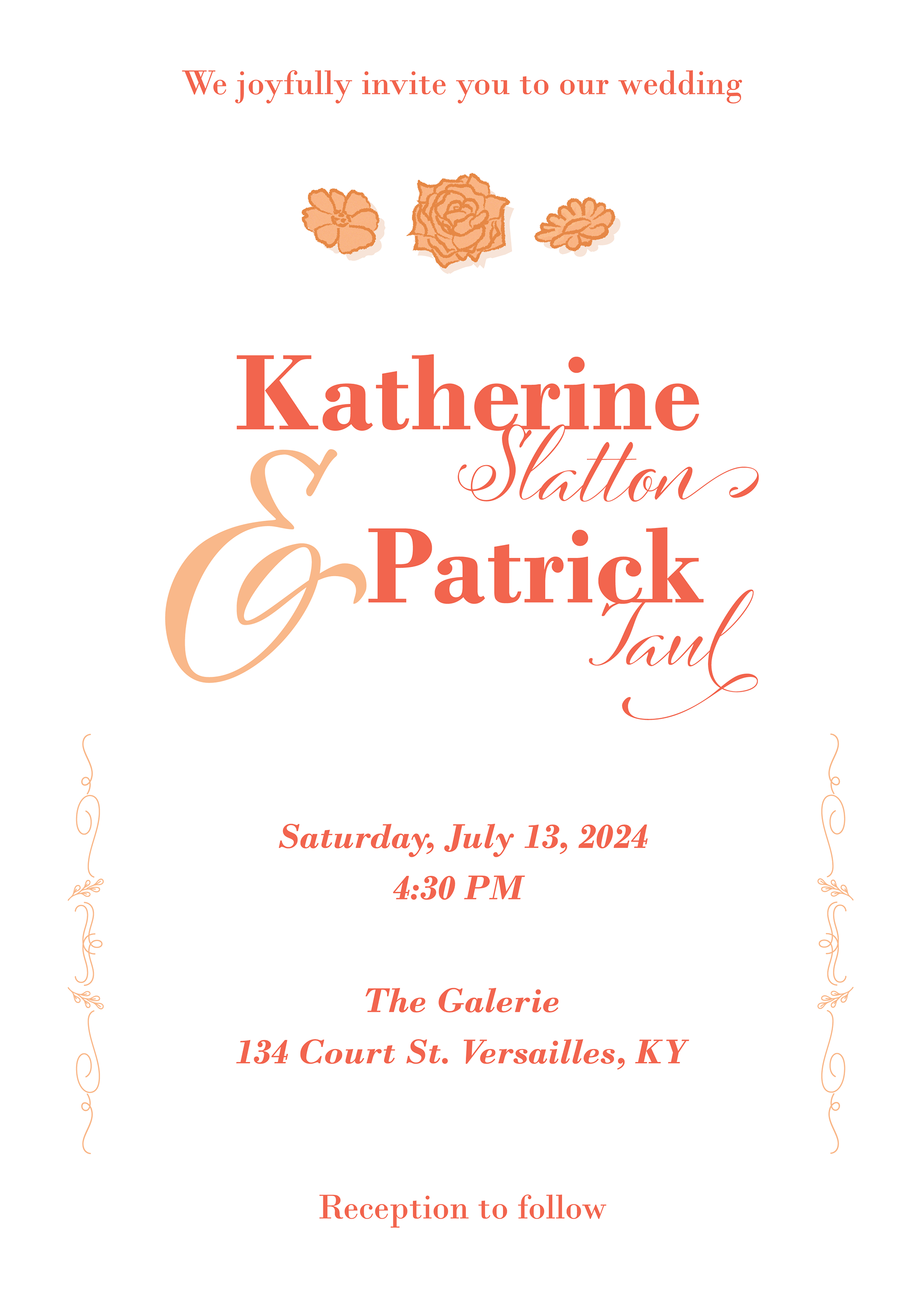
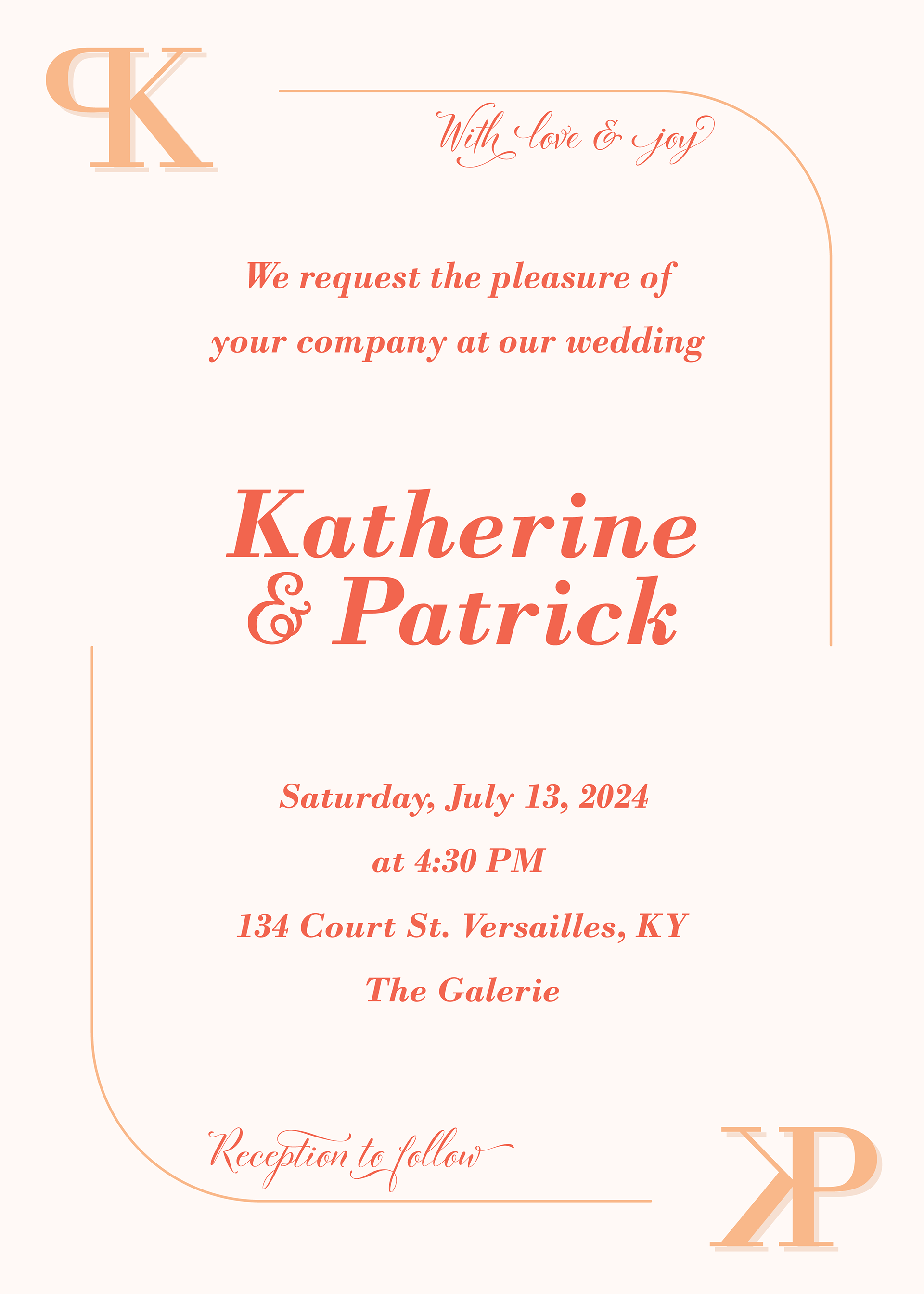
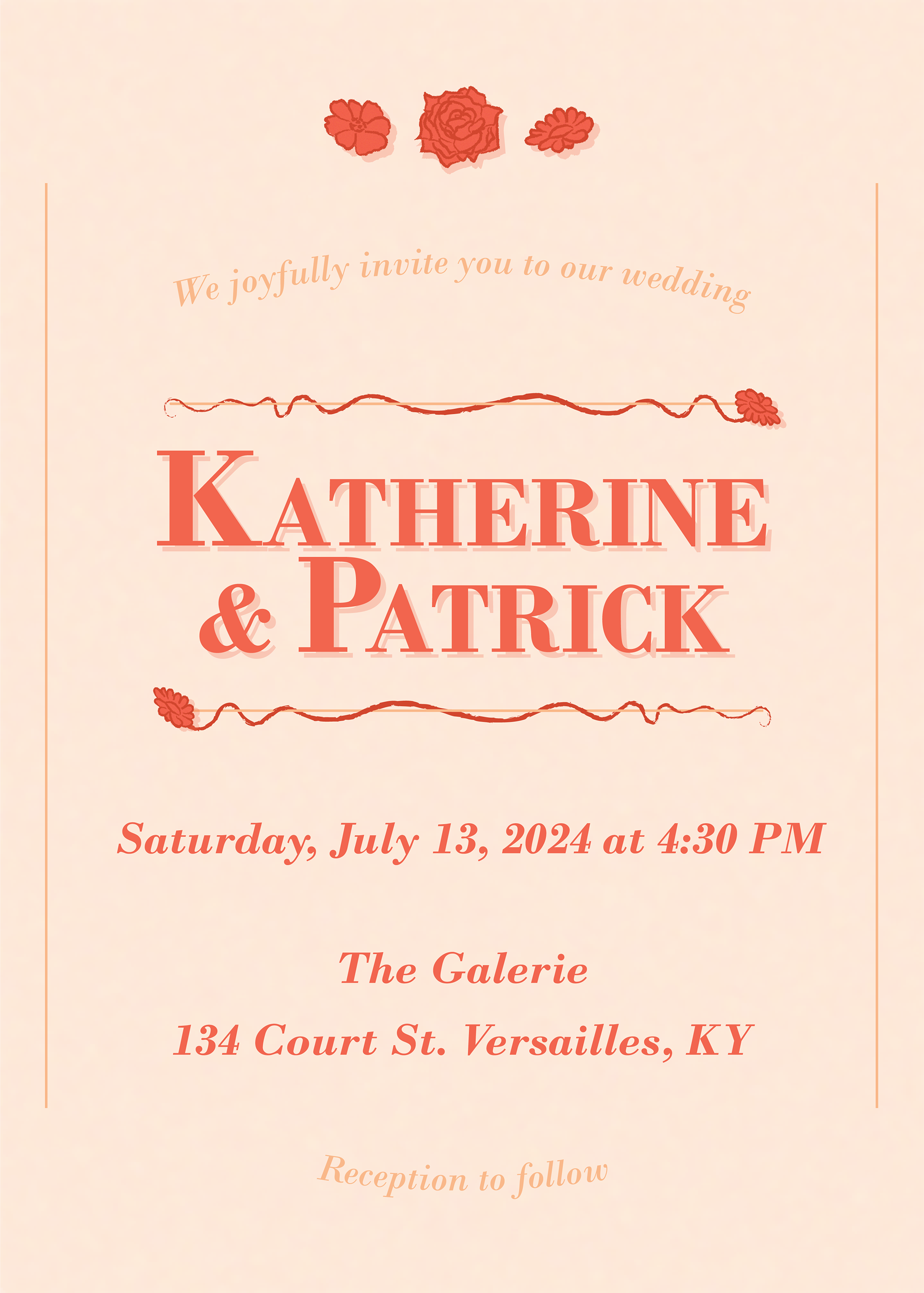
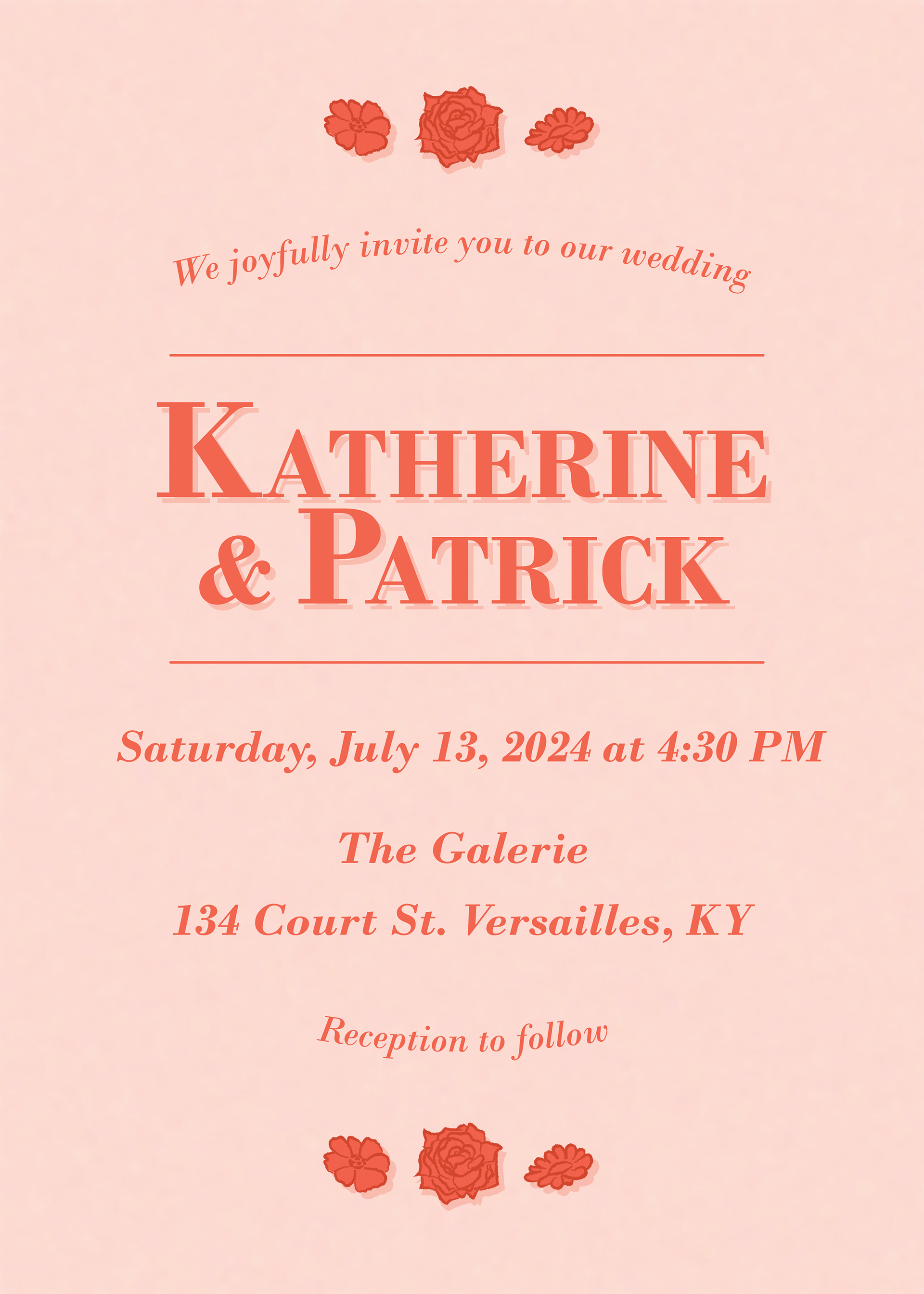
These are the first drafts I made for the Wedding Invitations. I played around with composition a lot because the client didn't have anything too specific in mind. I focused on unity by using the same color palate, fonts, and flower imagery as the Save-the-Dates to make both of these works feel cohesive.
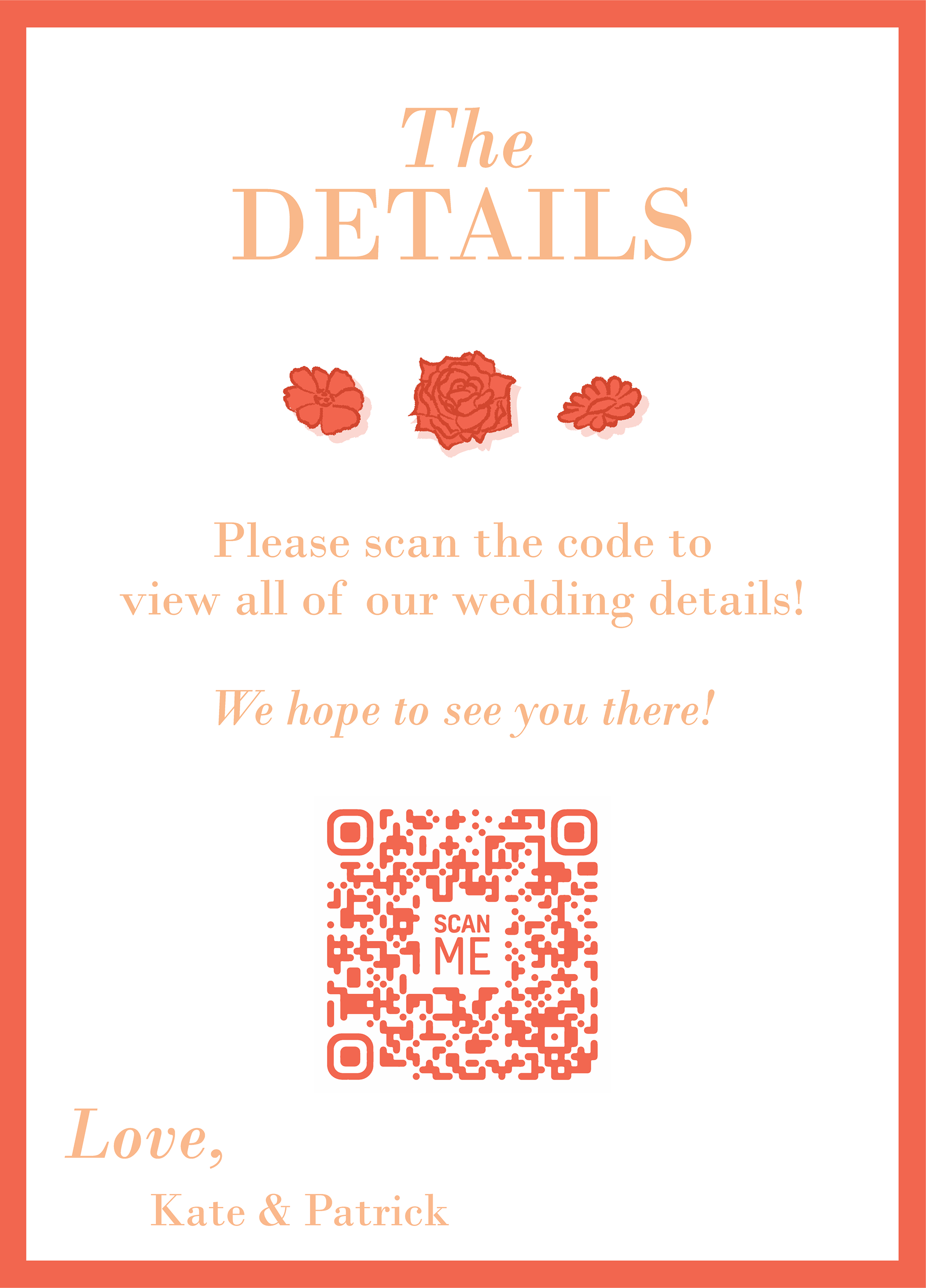
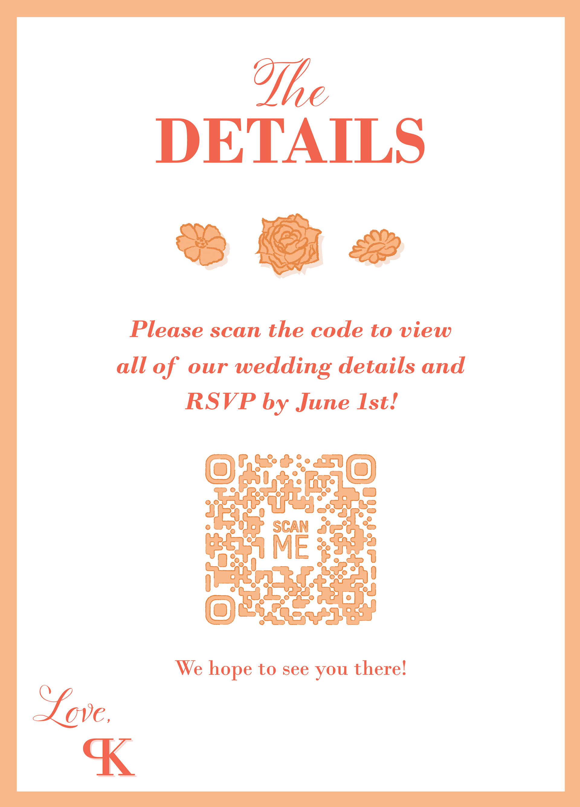
These are the first drafts for the backsides to both the Save-the-Dates and Wedding Invitations. Once again, I wanted to create unity so I used the same color scheme and imagery. I did want to reverse the colors so that they weren't exactly the same, however. I mostly focused on composition with these drafts to test which composition would best suit the images alongside the text.
